

Trying VIRAL TikTok trends ✅
She tried the VIRAL TikTok HACK 🫣
Beautycuriosity 6engagement 5competence 2
🔗 https://hismileteeth.com/products/colour-corrector
Voici une synthèse des patterns récurrents extraits des 32 templates d'analyse pour le format PRODUCT DEMO / FOCUS.
Le format Product Demo / Focus repose sur la starification absolue de l’objet. Son intention est d’éliminer toute friction cognitive en présentant le produit soit dans sa perfection esthétique (statique), soit dans sa résolution immédiate d’un problème (vidéo). Sa force psychologique réside dans la clarté totale : l'utilisateur comprend en moins de 2 secondes ce qu'est le produit, ce qu'il promet et pourquoi il est supérieur.
Le hook dans ce format est soit une annonce de nouveauté, soit une interpellation directe sur un "pain point".
| Pattern hook | Occurrences | Exemples verbatim |
|---|---|---|
| Annonce de nouveauté (The New/Introducing) | 12 | "THE NEW", "INTRODUCING", "Introducing the new Cosmic Collection" |
| Identification du Pain Point (Le Problème) | 8 | "Hader du det her? 😡", "Lost a sock in the dryer?", "לא מצליחה להתרכז במהלך היום?" |
| Preuve d'Autorité / Social Proof | 5 | "MEN'S JOURNAL: Best Multi for Men Over 50", "Showing my NY Grandma... for her honest opinion" |
| Ancrage Statistique | 3 | "20% of U.S. adults say they sleep 5 hours or less", "70 quality ingredients" |
| Question de Choix / Quiz | 4 | "WHICH PAIR DO YOU NEED?", "Why wait for winter?" |
L'angle définit la manière dont le produit est "vendu" psychologiquement.
| Angle | Occurrences | Quand l'utiliser |
|---|---|---|
| Nouveauté / Exclusivité (The Drop) | High | Pour un lancement de collection ou une édition limitée. |
| Problème / Solution Radical | Medium | Pour des produits utilitaires (nettoyage, suppléments, organisation). |
| Appartenance / Identité (Tribalisme) | Medium | Pour le textile ou l'outdoor (Spirit, Varsity, Never skip pay day). |
| Bundle / Économie (The Kit) | Low | Pour augmenter l'AOV (Panier Moyen) via des "Kits" ou "Bundles". |
| Esthétique / Lifestyle "Clean" | High | Pour les marques Premium/DTC misant sur le design minimaliste. |
1. The Grid (La Grille) : Utilisation de grilles (3x3 ou 4x3) pour montrer la variété (couleurs, modèles) et donner un aspect "catalogue natif" (Ex: Sistie, Rezetstore, SO CPH).
2. The Split Layout : Image coupée en deux : la partie haute montre l'usage lifestyle, la partie basse montre les détails techniques ou les coloris (Ex: Ela & Earth).
3. The Comparison / Quiz : Présentation de 3 variantes côte à côte avec leurs bénéfices spécifiques pour aider le client à choisir (Ex: Loop Earplugs).
4. The "Satisfying" Demo : En vidéo, montrer le produit en train de transformer un état "sale/mauvais" en "propre/parfait" sans artifice de montage (Ex: Mad Acid, Vision Clear Pro, Pet Powder).
5. The Authority Anchor : Placer un logo de média ou un avis d'expert en haut de l'image pour transférer la confiance sur le produit (Ex: Thorne).
Pour un nouveau client, voici 3 patterns concrets à copier :
1. Le pattern "Pantone Swatches" : Prends une photo studio ultra-propre de ton produit décliné en 3 couleurs. Superpose des petits blocs de couleur avec des codes techniques (ex: "Sandstone 7506 C"). Cela donne une impression de design expert et haut de gamme.
2. Le pattern "Reality Check" : En vidéo, tiens le produit physique devant ton écran d'ordinateur qui affiche ta page produit. Cela valide instantanément que "ce que vous voyez est ce que vous recevez".
3. Le pattern "Problem/Result Split" : Pour un produit utilitaire, commence par une vue subjective (POV) du problème (ex: pare-brise sous la pluie), puis montre l'application du produit et le résultat immédiat (l'eau qui glisse). Ajoute un texte simple : "Hader du det her? 😡".
She tried the VIRAL TikTok HACK 🫣

She tried the VIRAL TikTok HACK 🫣

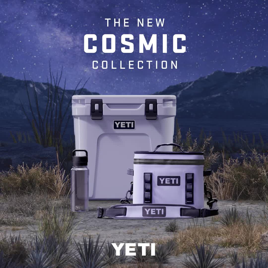
Introducing the new Cosmic Collection. A limited edition color inspired by dark sky country.
Voici une analyse détaillée de la publicité Meta pour la collection Cosmic de YETI.
---
1. Le groupe de produits central (le pack violet).
2. Le mot "COSMIC" en grosses lettres capitales.
3. Le logo YETI blanc en bas, qui ancre la marque.
Headline principal (image) :
Body text (caption Meta) :
CTA :
"Square 1:1 ad visual at 2K resolution. A group of premium outdoor gear (a hard cooler, a soft cooler bag, and a water bottle) in a pale lavender/lilac color. The products are centered and arranged in a pyramid composition on a dry, brushy ground. The background is a majestic dark sky country landscape at night, featuring a deep indigo starry sky with the Milky Way visible. Typography: Bold, blocky sans-serif font in white. Text displayed: 'THE NEW COSMIC COLLECTION' at the top center, and a large 'YETI' logo at the bottom center. Style: High-end professional product photography with dramatic studio lighting on the products, integrated into a photorealistic night wilderness scene. Palette: Deep purples, indigos, and glowing pale violet."

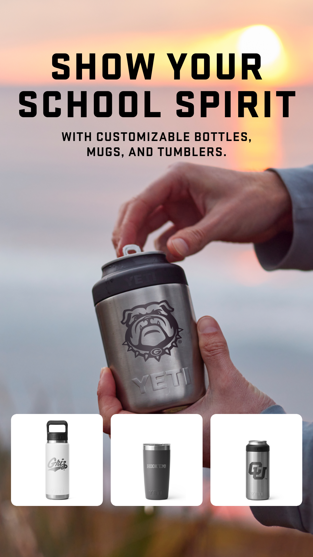
Show your school spirit, rep your house, or do your own thing with custom text, monogram, and designs.
Voici une analyse détaillée de la publicité Meta pour YETI.
---
1. Headline (Texte haut)
2. Produit principal en main (Le Can Cooler avec le logo Bulldog)
3. Galerie de produits en bas (Preuve de la variété de la gamme).
---
---
---
---
---
"Vertical 9:16 ad visual. Layout: Split into three sections. Top section features large, bold, black sans-serif text in all caps. Middle section is a high-quality lifestyle photo of a hand holding a stainless steel drinkware item with a collegiate sports logo, set against a warm, out-of-focus sunset beach background. Bottom section contains three distinct white square tiles, each showing a different YETI product (bottle, tumbler, can cooler) with different university logos. Typography: Heavy athletic-style sans-serif. Palette: Warm sunset oranges, steel grey, and deep blacks. Text displayed: 'SHOW YOUR SCHOOL SPIRIT' and 'WITH CUSTOMIZABLE BOTTLES, MUGS, AND TUMBLERS.' Style: Premium lifestyle photography combined with clean e-commerce product shots."
---


Say goodbye to the limited edition Hyper Lime Ridge Wallet. Grab it now before it's too late!
Save 30% off Wallet + KeyCase Kit.


👉Our BRAND NEW offer is here👈
Save 50% on your first box of Factor!

Try The Strongest Water Spot Remover, Metal, And Wheel Cleaner On The Market!<br /> <br /> MAD ACID HEAVY-DUTY WHEEL CLEANER, METAL CLEANER, & WATER SPOT REMOVER<br /> <br /> Our Famous MAD Acid Heavy Duty Metal and Wheel Cleaner is an acid-based formula that easily breaks down inorganic matter such as caked-on brake dust, salt, oxidation, and heavy road film. It is a gel-based formula that allows it to stick to the face of the wheel, which saves the product from running off. Not only can it completely restore metals, but it can also easily remove hard water spots from your windows!<br /> <br /> Click Below To Try Our MAD Acid 100% Risk-Free Today!👇<br /> <br /> p.s We have also used our MAD Acid over on our youtube channel to transform some of the nastiest cars on youtube! MAD Detailing
---
Voici une analyse détaillée de cette publicité vidéo pour le produit Mad Acid.
---
⏱ 0-3s HOOK :
⏱ 3-10s PROBLÈME/SETUP :
⏱ 10-30s SOLUTION/PROOF :
⏱ Fin CTA :
---
[Promesse de résultat immédiat]
"Today I'm showing how I can restore these chrome wheels in seconds using our Mad Acid."
[Éducation & Crédibilité]
"So the fastest way to clean these wheels would be to take our Mad Acid and spray it directly... let it sit for about 15-20 seconds."
[Preuve par l'action (UGC Style)]
"But for the sake of this video I'm going to take our Mad Acid and spray it directly onto a microfiber towel and I'll clean this part of the wheel."
[Contraste Visuel Radical]
(Séquence de gros plans sur le chrome brillant vs la jante terne)
[Appel à l'Action Direct]
"If you guys would like to try our Mad Acid cleaner today, click the link down below or in the bio."
---
---
---
Try The Strongest Water Spot Remover, Metal, And Wheel Cleaner On The Market!<br /> <br /> MAD ACID HEAVY-DUTY WHEEL CLEANER, METAL CLEANER, & WATER SPOT REMOVER<br /> <br /> Our Famous MAD Acid Heavy Duty Metal and Wheel Cleaner is an acid-based formula that easily breaks down inorganic matter such as caked-on brake dust, salt, oxidation, and heavy road film. It is a gel-based formula that allows it to stick to the face of the wheel, which saves the product from running off. Not only can it completely restore metals, but it can also easily remove hard water spots from your windows!<br /> <br /> Click Below To Try Our MAD Acid 100% Risk-Free Today!👇<br /> <br /> p.s We have also used our MAD Acid over on our youtube channel to transform some of the nastiest cars on youtube! MAD Detailing
---
Voici une analyse détaillée de la publicité vidéo pour le produit "Mad Acid" de MAD Chemicals.
---
⏱ 0-3s HOOK
⏱ 3-10s PROBLÈME/SETUP
⏱ 10-30s SOLUTION/PROOF
⏱ Fin CTA
---
[Promesse de transformation rapide]
"Today I'm showing how I can restore these chrome wheels in seconds using our Mad Acid."
[Éducation produit & Gain de temps]
"So the fastest way to clean these wheels would be to take our Mad Acid and spray it directly onto the wheel, let it sit for about 15-20 seconds, and then simply spray it off."
[Démonstration de transparence (Setup démo)]
"But for the sake of this video I'm going to take our Mad Acid and spray it directly onto a microfiber towel and I'll clean this part of the wheel."
[Preuve visuelle irréfutable (Action)]
(Séquence de frottage montrant le chrome briller sous la crasse)
[Appel à l'action direct]
"So if you guys would like to try our Mad Acid cleaner today, click the link down below or in the bio."
---
---
---

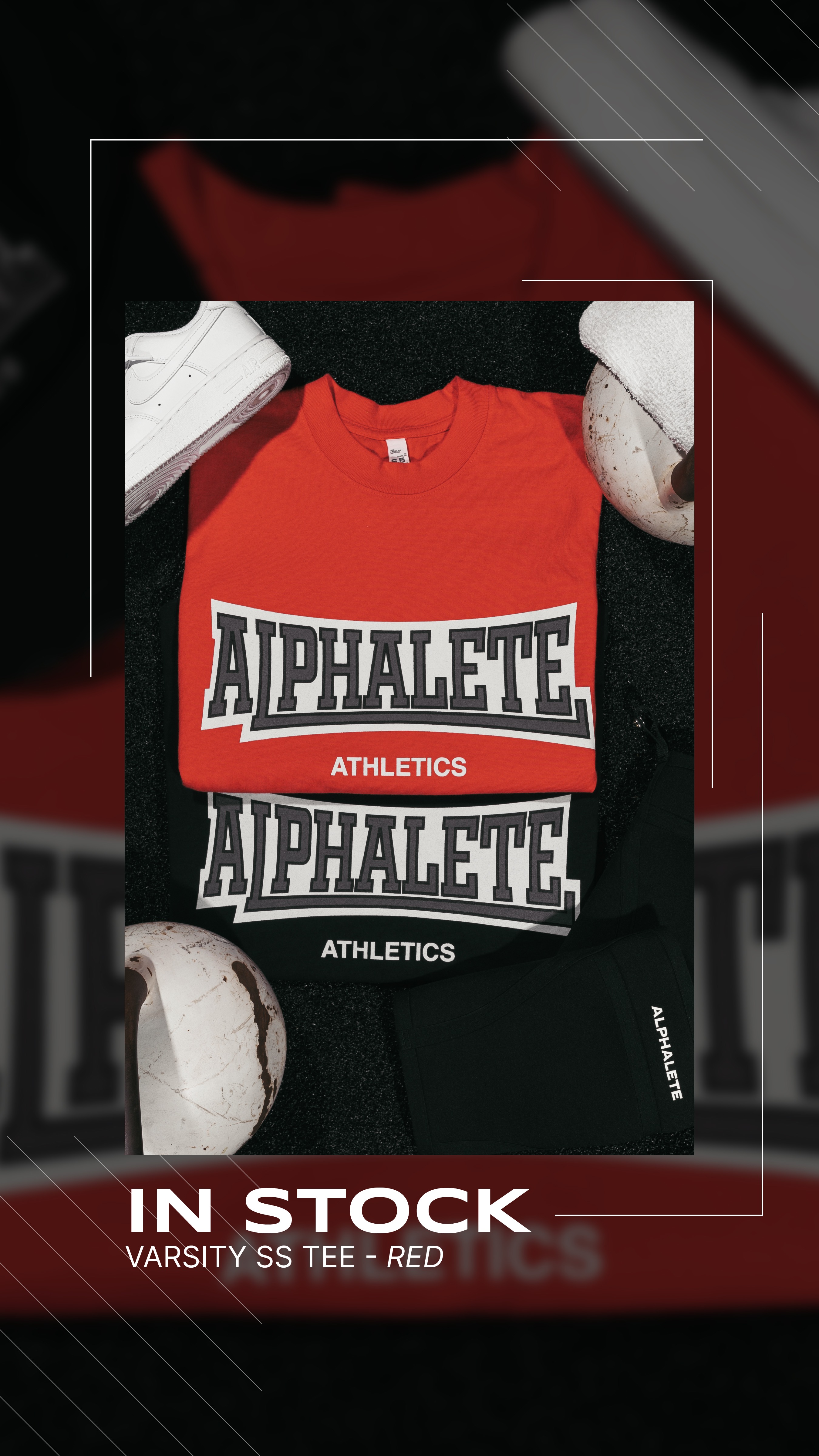
Bring the heat this summer with new Alphalete Graphic Tees and Hats. Shop Now!
Voici une analyse détaillée de la création publicitaire pour la marque Alphalete.
---
1. Le t-shirt rouge (produit phare).
2. Le texte "IN STOCK" en bas (information de disponibilité).
3. Les accessoires blancs (chaussure Nike Air Force 1 et kettlebell blanche) qui équilibrent la composition.
[Statut de l'offre]
"IN STOCK"
Technique : Urgence de disponibilité / FOMO inversé (C'est là, profitez-en).
Réaction visée : Soulagement ou excitation ("Enfin disponible").
Hypothèse : Le spectateur connaît déjà la marque ou attendait ce drop.
[Identification produit]
"VARSITY SS TEE - RED"
Technique : Descriptif technique simple.
Réaction visée : Clarté immédiate sur ce qui est vendu.
[Appel à l'identité]
"Live It, Wear It, Rep it"
Technique : Règle de trois / Verbes d'action.
Réaction visée : Sentiment de loyauté envers la communauté "Alphalete".
[Promesse saisonnière]
"Bring the heat this summer with new Alphalete Graphic Tees and Hats."
Technique : Pertinence temporelle (été) + Extension de gamme (tees et chapeaux).
Réaction visée : Projection dans l'usage futur.
"SHOP NOW"
Technique : Direct Response classique.
"Vertical 9:16 ad visual at 2K resolution. Professional flat lay photography of two folded t-shirts (one vibrant red on top, one black underneath) placed on a dark, textured gym flooring. Top t-shirt features a large 'Varsity' style collegiate logo. Include a white sneaker and a white vintage kettlebell as lifestyle props in the corners. A thin white rectangular graphic frame overlays the composition. Typography at the bottom: 'IN STOCK' in bold white sans-serif, and 'VARSITY SS TEE - RED' in smaller font. High contrast, cinematic lighting with soft shadows."

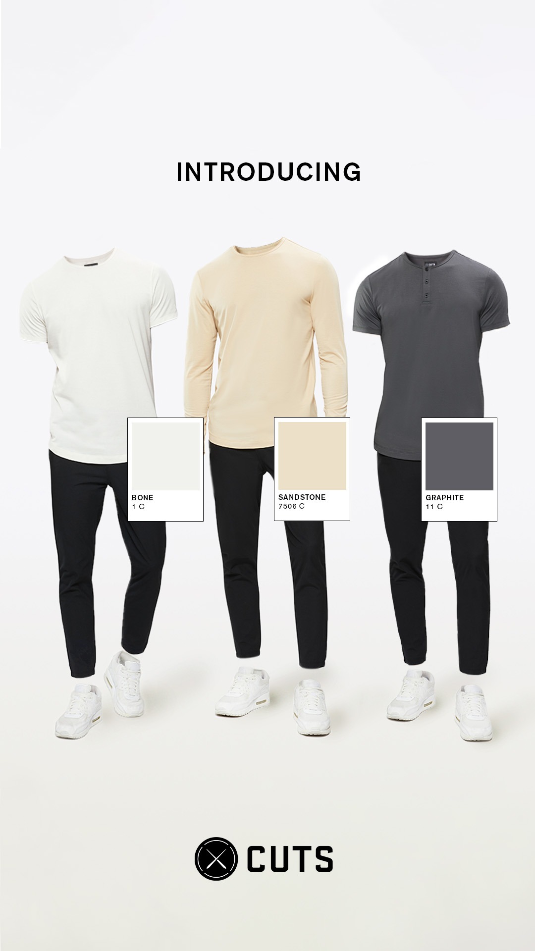
Introducing Sandstone, Bone, and Graphite, our first color drop of the Spring '23 Collection. A curation of fresh neutral tones that will elevate your wardrobe.
Voici une analyse détaillée de la création publicitaire pour la marque Cuts.
---
1. Les trois hauts (couleurs contrastées sur le blanc).
2. Le mot "INTRODUCING" (annonce de nouveauté).
3. Les vignettes de couleurs avec leurs codes (détail technique).
4. Le logo "CUTS" en bas (ancrage de marque).
[Annonce de lancement]
"INTRODUCING"
Technique : Direct et autoritaire.
Réaction visée : Curiosité face à une nouveauté.
Hypothèse : Le spectateur connaît déjà Cuts ou cherche activement de nouveaux basiques.
[Spécification produit]
"BONE 1 C / SANDSTONE 7506 C / GRAPHITE 11 C"
Technique : Nomenclature technique (Style Pantone).
Réaction visée : Perception de qualité supérieure et de précision chromatique.
Hypothèse : L'audience est sensible aux nuances de couleurs subtiles (neutres).
[Annonce produit]
"Introducing Sandstone, Bone, and Graphite, our first color drop of the Spring '23 Collection."
Technique : Exclusivité et temporalité (Spring '23).
Réaction visée : Sentiment d'actualité.
[Promesse de valeur]
"A curation of fresh neutral tones that will elevate your wardrobe."
Technique : Bénéfice aspirationnel ("elevate").
Réaction visée : Désir de montée en gamme personnelle.
"Shop Now"
Technique : Direct Response classique.
Réaction visée : Passage à l'action immédiat.
"Square 1:1 ad visual at 2K resolution. A minimalist fashion showcase featuring three male models standing side-by-side against a solid off-white studio background. The models are cropped at the neck (headless) and are wearing different styles: a white short-sleeve t-shirt, a sandstone long-sleeve crewneck, and a graphite grey short-sleeve henley. All models wear slim-fit black trousers and clean white sneakers. Over each shirt, place a white rectangular color swatch card (Pantone style) showing the color of the garment with text labels: 'BONE 1 C', 'SANDSTONE 7506 C', and 'GRAPHITE 11 C'. At the top center, bold black sans-serif text 'INTRODUCING'. At the bottom center, the brand logo 'CUTS' with a minimalist crossed-circle icon. High-end lighting, clean shadows, premium e-commerce aesthetic."

Introducing Sandstone, Bone, and Graphite, our first color drop of the Spring '23 Collection. A curation of fresh neutral tones that will elevate your wardrobe.
Voici une analyse détaillée de la créa publicitaire pour la marque Cuts.
---
1. Les trois silhouettes alignées (Impact global).
2. Le mot "INTRODUCING" (Annonce de nouveauté).
3. Les carrés de couleurs avec leurs noms (Focus produit/couleur).
4. Le logo "CUTS" en bas (Attribution de marque).
"Square 1:1 ad visual at 2K resolution. A minimalist fashion showcase featuring three headless male silhouettes standing side-by-side against a pure off-white studio background. Each figure wears black slim-fit trousers and white sneakers. The three figures wear different styles: left is a white t-shirt, middle is a beige long-sleeve, right is a dark grey henley. Overlaid on each chest area is a professional Pantone-style color swatch card with text: 'BONE 1 C', 'SANDSTONE 7506 C', and 'GRAPHITE 11 C'. Bold sans-serif text 'INTRODUCING' centered at the top. Brand logo 'CUTS' centered at the bottom. High-key lighting, premium e-commerce photography style."

Introducing Sandstone, Bone, and Graphite, our first color drop of the Spring '23 Collection. A curation of fresh neutral tones that will elevate your wardrobe.
Voici une analyse détaillée de la création publicitaire pour la marque Cuts.
---
1. Les trois hauts colorés (centre de l'image).
2. Le mot "INTRODUCING" (en haut).
3. Les cartes de couleurs avec codes techniques (milieu).
4. Le logo "CUTS" (bas).
[Hook de nouveauté]
"INTRODUCING"
Technique : Annonce directe.
Réaction visée : Curiosité immédiate pour découvrir ce qui est "nouveau".
Hypothèse : L'audience connaît déjà Cuts ou cherche activement de nouveaux basiques de qualité.
[Preuve d'expertise/Précision]
"BONE 1 C / SANDSTONE 7506 C / GRAPHITE 11 C"
Technique : Jargon de design (Pantone-style).
Réaction visée : Sentiment de qualité "ingéniée" et de choix délibéré des teintes.
Hypothèse : Le spectateur est sensible aux nuances de couleurs et au design soigné.
[Annonce produit]
"Introducing Sandstone, Bone, and Graphite, our first color drop of the Spring '23 Collection."
Technique : Exclusivité temporelle (Drop).
Réaction visée : Sentiment de fraîcheur et de saisonnalité.
[Promesse de bénéfice]
"A curation of fresh neutral tones that will elevate your wardrobe."
Technique : Transformation (Elevate).
Réaction visée : Désir de montée en gamme personnelle.
Hypothèse : Le garde-robe actuelle de l'utilisateur est jugée trop basique ou terne.
[Appel à l'action]
"SHOP NOW"
Technique : Directe.
Réaction visée : Passage à l'achat immédiat.
"Portrait 4:5 (or Square 1:1) ad visual at 2K resolution. Minimalist white background. Three male outfits displayed side-by-side using the 'invisible man' effect (ghost mannequin). The left outfit has a bone-white t-shirt, the middle a sandstone long-sleeve, and the right a graphite-grey henley shirt. All three wear slim-fit black trousers and white sneakers. Overlapping each shirt, place a minimalist white square card resembling a Pantone swatch, featuring a color block and technical text: 'BONE 1 C', 'SANDSTONE 7506 C', and 'GRAPHITE 11 C'. At the top, bold sans-serif text 'INTRODUCING'. At the bottom, a minimalist black circular X logo followed by the brand name 'CUTS' in bold architectural sans-serif font. High-end studio lighting, clean shadows."


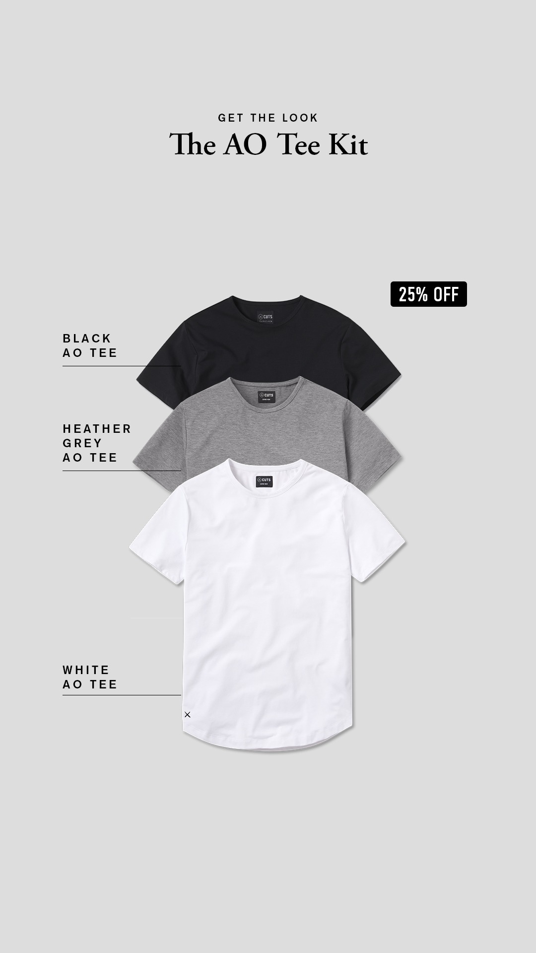
Elevate your daily wardrobe. Our team hand-curated a KIT that's tailor-made for the new world of work. Get 25% OFF for a limited time only.
Voici une analyse détaillée de la publicité pour Cuts Clothing.
---
1. La pile de produits (le "Kit").
2. Le badge noir "25% OFF" (fort contraste, coin supérieur droit).
3. Le titre principal "The AO Tee Kit".
4. Les annotations de couleurs (Black, Heather Grey, White).
[Promesse de style]
"GET THE LOOK"
Technique : Commandement aspirationnel.
Réaction visée : "Je veux cette apparence soignée."
[Identification du produit]
"The AO Tee Kit"
Technique : Naming de produit propriétaire.
Réaction visée : Sentiment d'exclusivité (ce n'est pas juste un pack, c'est un "Kit").
[Bénéfice principal]
"Elevate your daily wardrobe."
Technique : Verbe d'action orienté statut.
Réaction visée : Désir d'amélioration de soi.
[Preuve de curation]
"Our team hand-curated a KIT"
Technique : Preuve d'expertise / Autorité.
Réaction visée : Confiance dans le choix des couleurs.
Hypothèse : Le client est indécis et veut qu'on choisisse le meilleur pour lui.
[Ciblage contextuel]
"tailor-made for the new world of work."
Technique : Résonance contextuelle (Work from home / Hybrid).
Réaction visée : "C'est exactement ce qu'il me faut pour mes réunions Zoom et le bureau."
[Offre irrésistible + Urgence]
"Get 25% OFF for a limited time only."
Technique : Incentive financière + FOMO.
Réaction visée : Passage à l'acte immédiat.
"Shop Now" (SHOP_NOW)
Technique : Directivité.
> "Portrait 9:16 ad visual for a clothing brand. Central element: A vertical stack of three premium folded t-shirts (top: black, middle: heather grey, bottom: white). Use thin black leader lines pointing from the left to each shirt with text labels: 'BLACK AO TEE', 'HEATHER GREY AO TEE', 'WHITE AO TEE' in small all-caps sans-serif. Top center text: 'GET THE LOOK' in small sans-serif, above 'The AO Tee Kit' in a large, elegant Serif font. Add a high-contrast black rectangular badge in the top right corner with white text: '25% OFF'. Background: Solid light neutral grey. Style: Clean, professional product photography with soft drop shadows. Overall aesthetic: Minimalist, luxury essential-wear."
Elevate your daily wardrobe. Our team hand-curated a KIT that's tailor-made for the new world of work. Get 25% OFF for a limited time only.
Voici une analyse détaillée de la publicité pour Cuts Clothing.
---
1. Le produit (les 3 t-shirts empilés).
2. Le badge "25% OFF" (l'incitation financière).
3. Le titre "The AO Tee Kit" (l'offre groupée).
4. Les labels descriptifs sur la gauche.
> "Portrait 9:16 (or Square 1:1) ad visual. Minimalist aesthetic. Center-aligned vertical stack of three premium t-shirts (Black on top, Heather Grey in middle, White at bottom). Use thin leader lines pointing from the left side to each shirt with text labels in all-caps sans-serif: 'BLACK AO TEE', 'HEATHER GREY AO TEE', 'WHITE AO TEE'. Top center text: 'GET THE LOOK' (small sans-serif) above 'The AO Tee Kit' (large elegant Serif font). Include a small high-contrast black rectangular badge in the top right corner with white bold text '25% OFF'. Background: solid light neutral grey. Studio lighting with soft natural drop shadows under the shirts for a premium feel."

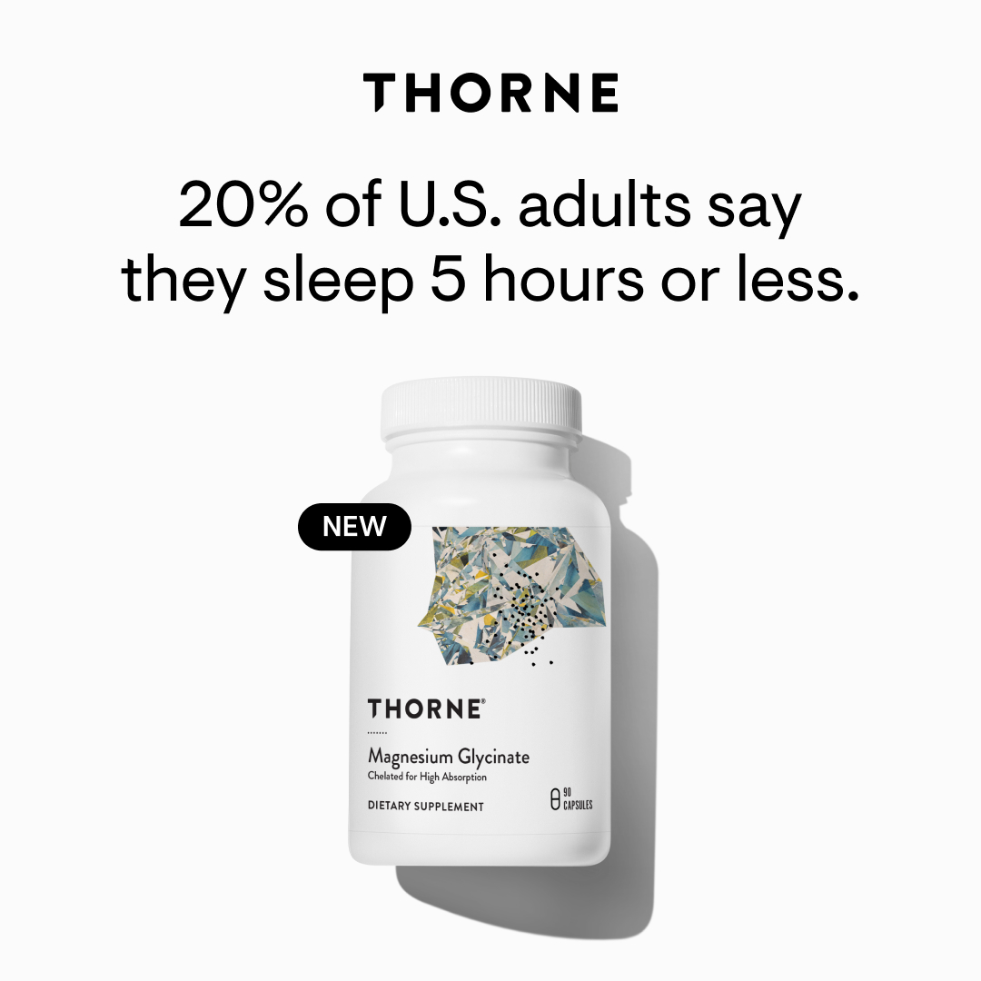
A 2023 Gallup poll shows sleep issues are on the rise. Get a good night's rest with Magnesium Glycinate, formulated for optimal absorption.* #onlyThorne


רוב הסיכויים שהמוצר הזה יגרום לבטן שלך להיות שטוחה ורגועה יותר💊
ואני מדברת על פרוביוטיקה fly שלנו.
ברגע שהבנתי כמה פרוביוטיקה היא נכס חיוני לגוף שלנו וכמה היא תומכת בכל התהליכים החשובים בגוף ומשדרגת את החיים ואת הגוף שלנו! התחלתי לחפש פרוביוטיקה שתהיה לשביעות רצוני, כי עד היום אני לוקחת פרוביוטיקה באופן קבוע
ולא מצאתי מוצר באמת ברמה גבוהה
עם כל מה שחשוב שיהיה בו!
וככל שחקרתי ובדקתי לעומק - הבנתי:
רוב התוספים שמוכרים היום ירודים לחלוטין...
הם עוברים כל כך הרבה ידיים,
עד שהם מגיעים למדפים,
ובמצב כזה האיכות של המוצר נפגע
ואנחנו מפסידות:
ומשלמות הרבה בעד מוצר ירוד מאוד.
אז החלטתי בעצמי לפתח פרוביוטיקה
ברמה הכי גבוהה שיש
ולפני 3 שנים הוצאתי את התוסף הראשון שלנו.
ובשנה וחצי האחרונה הוצאתי גרסה חדשה משודרגת שעולה על כל התוספים שיש היום בשוק!

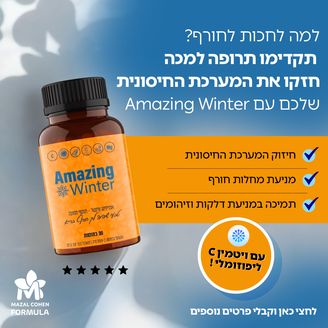
החורף הזה תהיי חזקה ובריאה יותר,עם קפסולות החורף הזה תהיי חזקה ובריאה יותר,עם קפסולות לפוזומאליות של מזל כהן !
מה את עושה כדי לשמור על עצמך בחורף?
עם ויטמין C ליפוזומלי, את זוכה לספיגה גבוהה יותר בזכות הטכנולוגיה הייחודית שמבטיחה שהוויטמין יגיע ישר לתאים שלך.
זה אומר יותר כוח למערכת החיסון, יותר אנרגיה ופחות מחלות!
הפורמולה שלנו לא רק קלה לשימוש, אלא גם נספגת בגוף בצורה יעילה הרבה יותר.
👈 חיזוק המערכת החיסונית
👈 מניעת מחלות חורף
👈 מתאימה לשגרה יומית ומחזקת את הגוף מבפנים!!
רוצה להתחיל להרגיש את ההבדל? 🍊
רכשי עכשיו >>

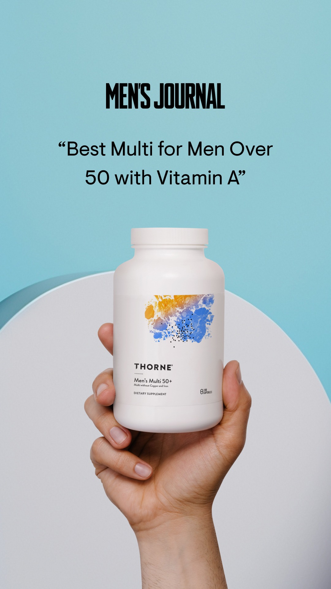
Your nutritional needs change with age! Support yourself with Thorne's Men's Multi 50+, a favorite of Men's Journal. #onlyThorne
Voici une analyse détaillée de la création publicitaire pour Thorne.
---
1. Logo Men's Journal (Autorité)
2. La citation centrale (Promesse/Produit)
3. Le produit physique tenu par la main (Tangibilité)
Chunk 1 : "MEN'S JOURNAL"
Chunk 2 : "“Best Multi for Men Over 50 with Vitamin A”"
Chunk 3 : "Your nutritional needs change with age!"
Chunk 4 : "Support yourself with Thorne's Men's Multi 50+, a favorite of Men's Journal."
Chunk 5 : "Shop Now"
"Square 1:1 ad visual at 2K resolution (adapted from 9:16). A human hand holding a clean, white supplement bottle in the lower center. Background is a solid, soft pastel blue. Top of the image features a bold, black logo of a reputable magazine (e.g., Men's Health or similar). Below the logo, centered text in a clean sans-serif font reads: '“Best Multi for Men Over 50 with Vitamin A”'. High-end studio lighting with soft shadows. Minimalist aesthetic with significant negative space. Text displayed: 'MEN’S JOURNAL' and '“Best Multi for Men Over 50 with Vitamin A”'. Professional product photography style."

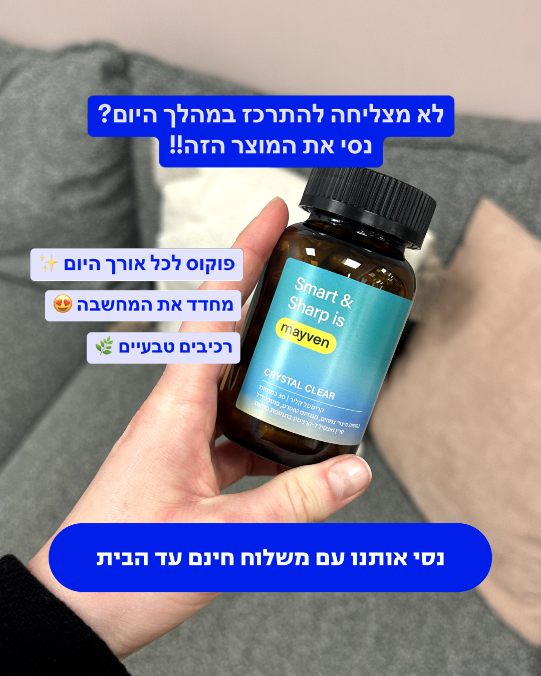
הפרעת קשב וריכוז? החדשות הטובות הן שיש מה לעשות וזו הסיבה שפיתחנו את קריסטל קליר עם רכיבים טבעיים שיעזרו לך להשיג יותר איזון בחיים, אז אם שרדת את הפוסט עד כאן, הנה 3 רכיבים מרכזיים
מגנזיום - חוסר במגנזיום יכול להתבטא בעצבנות, חוסר שקט, וקושי להתרכז
זעפרן - מחקרים מצאו שזעפרן עשוי לתרום לשיפור התפקוד היומי ושיפור מצב הרוח
גינקו בילובה - נמצא כאפקטיבי מאוד לשיפור הקוגניציה ובכך להפחית את הרעשים והסחות הדעת


Óculos de sol transformam qualquer visual. Carregue no olhar o verão o ano todo, com um Zerezes que é a sua cara ::) Conheça os nossos modelos com design autoral que já se tornaram clássicos por aqui. Disponíveis no site e lojas físicas!

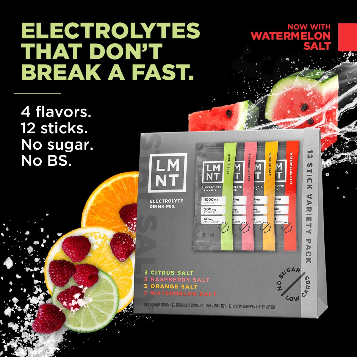
Feel and perform your best with LMNT’s science-backed, zero-sugar electrolyte ratio ⚡
Voici une analyse détaillée de la publicité Meta pour LMNT.
---
1. Le Headline : La promesse fonctionnelle (Jeûne).
2. Le Produit : Le Variety Pack au centre, entouré d'ingrédients réels (fruits, sel).
3. L'Argumentaire : La liste à puces "4 flavors / No BS" qui valide l'intérêt technique.
"ELECTROLYTES THAT DON'T BREAK A FAST."
"4 flavors. 12 sticks. No sugar. No BS."
"NOW WITH WATERMELON SALT"
"Feel and perform your best with LMNT’s science-backed, zero-sugar electrolyte ratio ⚡"
"LEARN_MORE"
> "Square 1:1 ad visual at 2K resolution. Layout: Split composition with a deep black background. High-contrast bold Sans-serif text on the top left. Visuals: Central 3D mockup of a variety pack box with electrolyte stick packs sticking out. Surround the box with dynamic water splashes and hyper-realistic fruit slices (orange, raspberry, lime, watermelon). Add coarse sea salt crystals scattered at the bottom. Palette: Black, Neon Green (#ccff00), and vibrant fruit colors. Text displayed: 'ELECTROLYTES THAT DON'T BREAK A FAST.' in large neon green/white block letters. Below it: '4 flavors. 12 sticks. No sugar. No BS.' Style: Premium commercial photography with high saturation and sharp focus."


LMNT refuels your body with what it loses when you sweat: electrolytes. Grab a stick of any of our delicious flavors, mix in your water bottle & rehydrate your body.

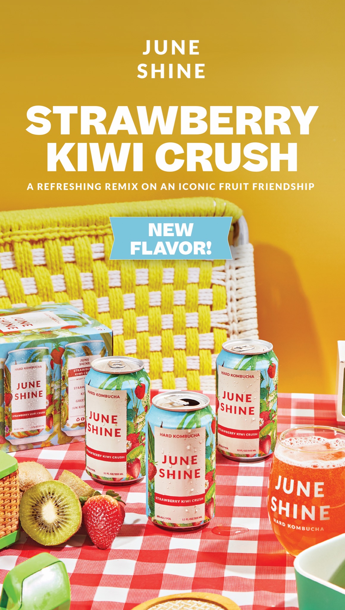
Looking for a summer fling? Meet Strawberry Kiwi Crush, our juicy new booch flavor ready to brighten your day all summer long ☀️
Nothing but real strawberries & kiwis and a whole lotta goodness in every drop 🍓🥝
Voici une analyse détaillée de la publicité Meta Ads pour la marque JuneShine.
---
1. Headline central : "STRAWBERRY KIWI CRUSH" (Le quoi).
2. Badge bleu : "NEW FLAVOR!" (L'urgence/nouveauté).
3. Produit : Les canettes et le verre (La preuve sociale/consommation).
4. Éléments de contexte : Fraises, kiwis et nappe à carreaux (La promesse de saveur et d'occasion de consommation).
"Square 1:1 ad visual at 2K resolution. Layout: High-angle lifestyle shot of a summer picnic. A bright yellow wall background with a yellow woven chair. A red and white checkered tablecloth in the foreground. Subject: Three open 12oz cans of 'JUNE SHINE' Hard Kombucha with condensation drops, one glass filled with sparkling amber liquid, and a 6-pack box. Garnish: Fresh halved kiwis and whole strawberries scattered naturally. Typography: Bold white sans-serif text centered at the top. Text displayed: 'STRAWBERRY KIWI CRUSH' in large caps, with 'A REFRESHING REMIX ON AN ICONIC FRUIT FRIENDSHIP' in smaller caps underneath. Add a bright blue ribbon badge saying 'NEW FLAVOR!'. Style: Vibrant, high-saturation commercial photography, bright natural sunlight."


IF WE LIKE IT, WE BUY IN MULTIPLE COLORS 👏🏼. Excited to wear these pregnant, but REALLY excited to make my breast feeding experience easier with @shopthemint ‘s new nursing collection. I love the prints + color options - they feel very “me” ☺️. Which color is your favorite?!
Comment SHOP below to receive a DM with the link to shop this post on my LTK ⬇ https://liketk.it/56XIv
All spring dress styles are linked in my LTK page!
#pregnancy #nursingmom #newmom #pregnancyjourney #pregnancystyle #momstyle #momtobe

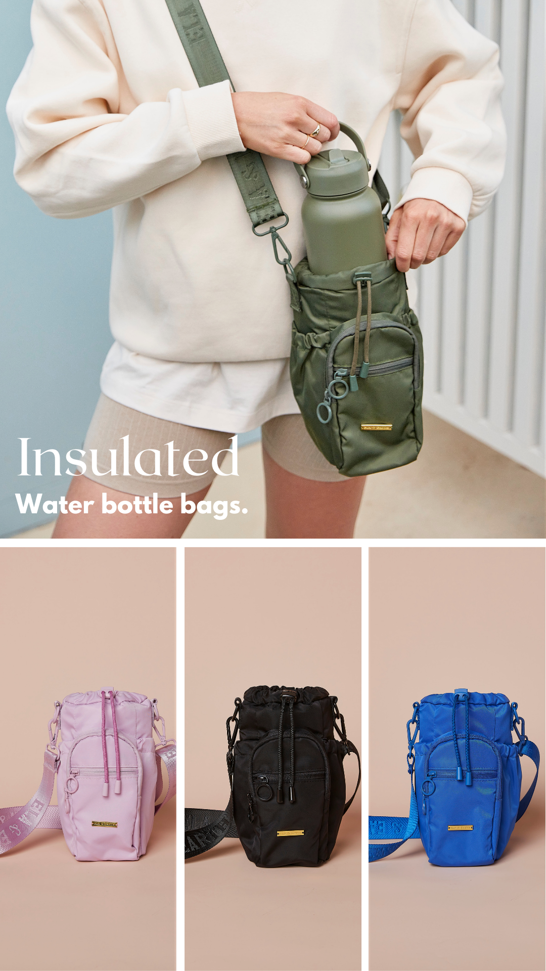
Carry your water bottle in style with our new water bottle bags, available in 6 colours!
💙 Insulated lining
💙 Drawstring closure
💙 Front zipped pockets and side pockets
💙 Adjustable shoulder strap
💙 Designed to fit our 1-litre and 550ml water bottles
Shop now with free shipping over $99 Australia-wide.
Voici une analyse détaillée de la publicité Meta pour la marque Ela & Earth.
---
1. L'action de la main avec la gourde (Haut).
2. Le mot "Insulated" en typographie Serif élégante (Centre gauche).
3. La grille de couleurs alternatives (Bas).
Chunk 1 :
"Insulated"
Chunk 2 :
"Water bottle bags."
Chunk 1 :
"Carry your water bottle in style with our new water bottle bags, available in 6 colours!"
Chunk 2 :
"💙 Insulated lining / 💙 Drawstring closure / 💙 Front zipped pockets and side pockets / 💙 Adjustable shoulder strap / 💙 Designed to fit our 1-litre and 550ml water bottles"
Chunk 3 :
"Shop now with free shipping over $99 Australia-wide."
"Portrait 4:5 ad visual at 2K resolution. Split layout: The top 60% features a lifestyle close-up of a person wearing a sage green crossbody bottle bag, putting a matching bottle inside. The person wears neutral cream/beige loungewear. The bottom 40% is a 3-column grid showing the product in different colors: pastel pink, solid black, and vibrant royal blue on a neutral beige background. Typography: Use a large, elegant Serif font for the word 'Insulated' and a clean Sans-serif for 'Water bottle bags.'. Text displayed: 'Insulated Water bottle bags.'. Professional studio photography style with soft shadows and high-end finish. Add a small gold brand plate detail on the bags."


The electric toothbrush, reimagined.
⚡40+ day battery life
♻️ Recyclable plant-based heads
⚙️ Repairable by design
✨ Self cleaning travel case
🪥 3x more plaque removed*
100 Day Money Back Guarantee
*than an ADA approved manual brush


The One Product I Use Everyday Without Fail, Is Future Kinds Essential Multivitamin 🚀 🌱

"לקחתי אולי על חצי אצבע שמתי קצת על השיער - ותקשיב טוב !! מאז אני לא מפסיק לקבל ואוו,ואוו,אווו.. הריח מריחים אותו מכמה מטרים! מוצר פ-צ-צ-ה! שירות אש יש לכם ובלי ספק אני אקנה שוב."<br /> .<br /> המוצר האחרון שתקנה לשיער שלך - הפתרון האולטימטיבי לגבר המודרני.<br /> 6 שנים של פיתוח המוצר הזה.<br /> .<br /> גבר תשמע טוב - זה המוצר האחרון שתקנה לשיער שלך.<br /> אם "טיפוח" זה מילה שלא מעניינת אותך - אבל כן מעניין אותך להריח טוב מהבוקר עד הערב, ולקבל אינספור מחמאות - כדאי שתמשיך לקרוא.<br /> .<br /> 75 שנה שאנחנו מייצרים מוצרים לשוק הגברים בארץ ובחו"ל. ב - 6 שנים האחרונות פיתחנו מוצר במיוחד לגבר המודרני הישראלי.<br /> .<br /> אז מה שונה במוצר הזה?<br /> .<br /> 👈 אתה הולך לקבל "וואו" מבחורות. יותר מ- 37 נשים הריחו את המוצר שלנו, כל אחת ואחת מהן הגיבה בוואו. הריח הזה ישאר עליך לכל היום.<br /> .<br /> 👈 אתה מקבל מוצר איכותי, באמת איכותי. לא נדבק לאצבעות, יושב מושלם על השיער - שילוב של ווקס וחימר - לא דביק מידי אבל לא דליל מידי. אתה תראה בשיא שלך.<br /> .<br /> ⏱ חוסך בזמן. דיי חלאס, בלי להתעסק דקות ארוכות בבוקר בשיער שלך כדי שיצא טוב. 20 שניות על הבוקר והשיער שלך חד עד הערב. בהבטחה.<br /> .<br /> ℹ כ- 20 גברים כבר התנסו במוצר. זה *חלק* ממה שאמרו-<br /> .<br /> ⭐⭐⭐⭐⭐ " חברה שלי משתגעת מהריח, יותר טוב מלשים בושם. הכי אהבתי אצלכם שלא נדבק לאצבעות נשטף בקלות.. קניתם אותי מחכה שיצא בארץ". - פיני ל.<br /> .<br /> ויש עוד.<br /> .<br /> אנחנו באנו לשנות את הסטדרנט בארץ. 75 שנה שאנחנו מייצרים למותגים בארץ ובחו"ל - והיום אנחנו מגשימים חלום שפותח במשך 6 שנים - פתרון אולטימיטיבי לגבר המודרני - מוצר טבעי שמתאים לכל סוגי השיער ויגרום לך להראות בשיא שלך. תזמין עכשיו - מבטיחים שלא תתחרט.<br /> .<br /> אתה יודע שאתה קונה פעם אחת ואתה מסודר לכל החיים.<br /> <br /> מתאים לך לכל מצב, מהיום יום בעבודה, לאירוע שיש לך היום בערב!<br /> .<br /> ⛔ נ.ב<br /> .<br /> המלאי באמת מוגבל! זה לא "בכאילו". אנחנו באמת על מלאי מוגבל ועם מחיר השקה שלא יחזור.. כדאי שתזמין כבר עכשיו.
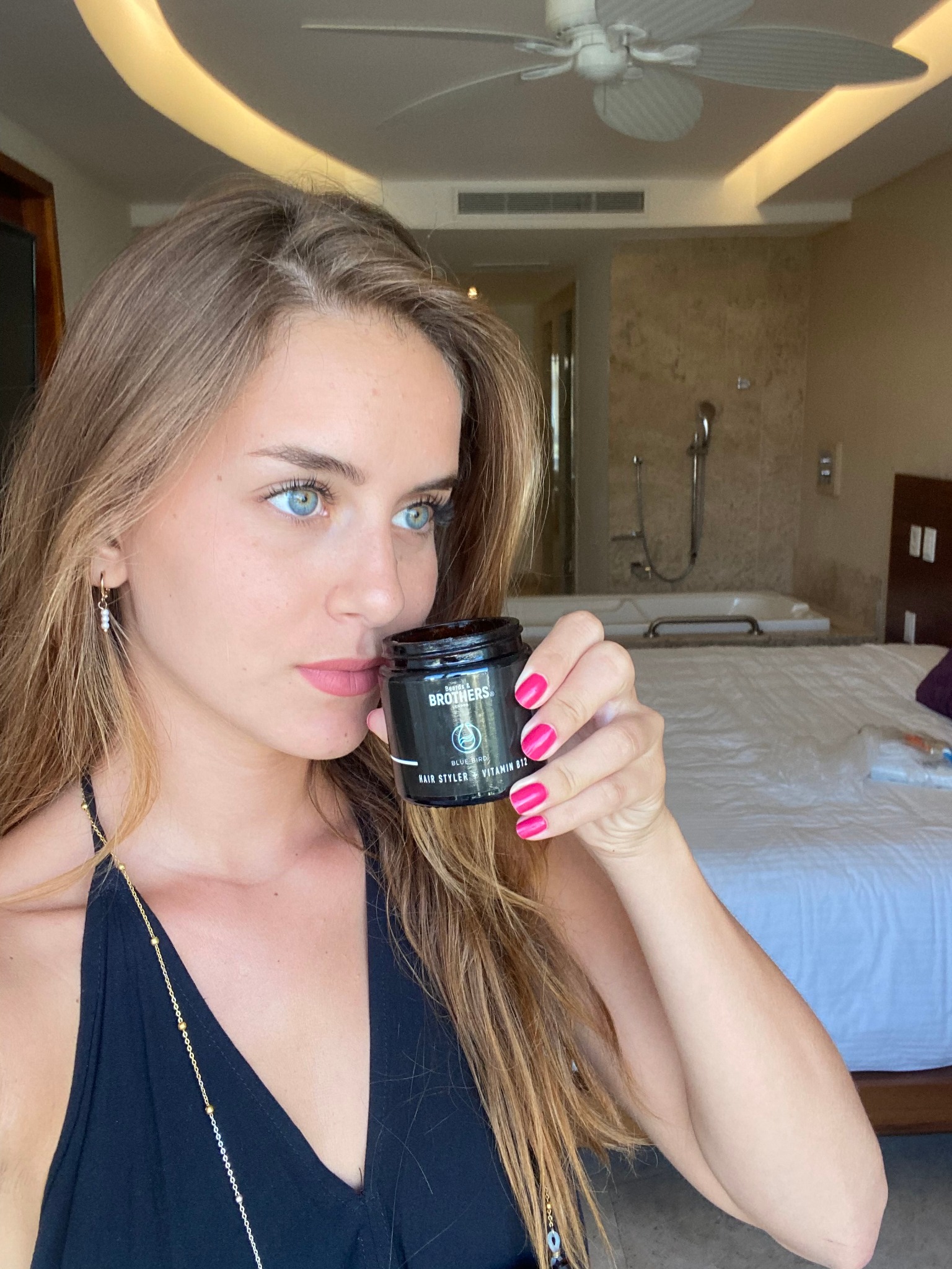
Voici une analyse détaillée de la publicité pour Beards & Brothers London.
---
Le visage de la jeune femme, et plus spécifiquement ses yeux bleus perçants qui contrastent avec sa peau mate. Le geste de "sentir" le produit crée une curiosité immédiate.
En utilisant le "Male Gaze" inversé : on utilise une femme très attrayante pour vendre un produit pour hommes. La couleur vive du vernis à ongles (rose fuchsia) crée un point de contraste chromatique fort contre le pot noir du produit, guidant l'œil vers l'objet vendu.
1. Le regard de la femme (émotion/beauté).
2. Le produit (objet central de l'action).
3. Les ongles roses (point d'accentuation).
4. Le décor luxueux en arrière-plan (contexte aspirationnel).
---
---
---
---
---
"Square 1:1 or Portrait 4:5 ad visual. Scene: A beautiful young woman with striking eyes is holding a small black cosmetic jar (hair wax) up to her nose, smelling it with a pleasant, intrigued expression. Setting: A high-end luxury hotel bathroom with marble textures and a bathtub in the soft-focus background. Details: The woman has bright, colorful manicured nails (fuchsia) to create a color pop. The product label is clearly visible. Style: High-quality lifestyle photography, natural lighting, looking like a high-end social media post. Color Palette: Warm neutrals, black, and a pop of bright pink."
---


👉 Find Sprinkle & Sweep at your nearest PetSmart and make pet accidents a worry of the past! Use our convenient store locator to find the closest spot to you: <a href="https://l.facebook.com/l.php?u=https%3A%2F%2Fwww.sprinkle-sweep.com%2Fpages%2Fstore-locator%3Ffbclid%3DIwAR33Kc87rjQPpy0oublAq27N0u81CsXS2sFSTAVTwDog82VxAC7Zv20o0fo&h=AT3IbyM5aobbVFfXbME0mNMHqNBkV7CQxN9Hub9FmA2L5wW2BzBMafEOUJMFOk0Gx2z1mPS5kCE8V9ugEEaGDNRteLQzusDjgeoI1c4zrosQv9cApwca6sZRwR9rMgTgEz9xBqMT" rel="nofollow noreferrer" target="_blank" data-lynx-mode="asynclazy">https://www.sprinkle-sweep.com/pages/store-locator</a>
---
Voici une analyse détaillée de la publicité vidéo selon ton protocole expert.
---
---
[Ciblage et Identification du problème]
"to the pet parents who are sick of using 83 paper towels every time you have to pick up an accident..."
[Démonstration de la solution (Visuel uniquement)]
(Action de verser la poudre et de voir l'absorption)
[Preuve de l'efficacité / Ease of Use]
(Action de balayer la poudre agglomérée)
[Appel à l'action / Curiosity Gap]
"...we have something for you (tap our username!)"
---
---
---

Stop med at køre blindt i regnvejr! 🌧️ Se, hvordan vandet forsvinder som magi fra ruden. Kun nu -50% RABAT + GRATIS FRAGT! 🇩🇰 #bil #motorkøretøj #kører #autopleje #gadgets #biltilbehør #lifehack #tildig #sikkerhed #danskbilist #autodetailing #usynligvisker #hydrofobisk
---
Voici une analyse détaillée de la publicité vidéo pour Vision Clear Pro, basée sur les standards de performance Meta Ads.
---
⏱ 0-3s HOOK :
⏱ 3-10s PROBLÈME/SETUP :
⏱ 10-25s SOLUTION/PROOF :
⏱ Fin CTA :
---
[Identification de la douleur (Pain Point)]
"Hader du det her? 😡"
[Démonstration de "Pattern Interrupt"]
Visuel du logo TikTok dessiné sur la vitre avec le produit
[Preuve de performance (Effet Wahou)]
L'eau glisse sur le rétroviseur instantanément
[Bénéfice final et Clarté]
"Få krystalklart udsyn ✨"
[Appel à l'action direct]
"Bestil på visionclearpro.com 🚛"
---
---
---

Never lose a sock again! 🧦 These genius socks come with a built-in button to keep them together through the washer & dryer. Say goodbye to missing socks forever! 🌀 #LaundryHack #NoMoreLostSocks #SockLife #LaundryTips #StayPaired #SmartSocks #LifeHacks
---
Voici une analyse détaillée de la publicité vidéo pour Evan Socks, réalisée selon votre processus d'expert Meta Ads.
---
---
[Accroche par le "Pain Point" universel]
"Lost a sock in the dryer?"
[Promesse de la solution]
"Now with Evan Socks you're not going to have that problem anymore."
[Démonstration de la fonctionnalité unique]
"There's a little button here on the side that you can actually just put the other sock through the button."
[Réassurance sur la durabilité]
"You can throw it in the washer, you can throw it in the dryer and you're not going to lose the mystery sock anymore."
[Preuve de gamme et choix]
"They do come in different color tones as well, different variety."
[Appel à l'action contextuel]
"Grab yourself a pair of Evan Socks in the TikTok shop today."
---
---
---
---
Voici une analyse détaillée de la publicité Meta pour AG1 (Athletic Greens) selon ton processus d'expertise.
---
---
[Preuve d'autorité par le nombre]
"70 quality ingredients"
Technique : Ancrage numérique.
Réaction visée : Impression de complétude et de valeur supérieure (en avoir pour son argent).
Hypothèse sous-jacente : Le spectateur cherche une solution "tout-en-un" pour simplifier sa supplémentation.
[Catégorisation simplifiée]
"Vitamins, Minerals, Probiotics"
Technique : Triade de bénéfices.
Réaction visée : Compréhension immédiate de la composition sans jargon complexe.
Hypothèse sous-jacente : Le spectateur sait qu'il a besoin de ces trois éléments mais ne veut pas prendre 10 pilules.
[Positionnement Premium]
"Uncompromising Quality"
Technique : Attribut de prestige.
Réaction visée : Sentiment de sécurité et d'exclusivité.
Hypothèse sous-jacente : Le spectateur est méfiant envers les compléments bon marché et privilégie la pureté.
[Promesse de performance mentale]
"Focus"
Technique : Bénéfice émotionnel/cognitif.
Réaction visée : "C'est exactement ce qu'il me faut pour ma journée de travail".
Hypothèse sous-jacente : L'audience cible est composée de professionnels ou de créatifs stressés.
[Offre promotionnelle à forte valeur perçue]
"Free annual supply of vitamin D3 + 5 travel packs"
Technique : Incentive (Cadeau gratuit).
Réaction visée : Réduction de la friction à l'achat ; sentiment de faire une "bonne affaire" sur un produit premium.
Hypothèse sous-jacente : Le prix est le principal frein à l'entrée, l'ajout de cadeaux compense la barrière tarifaire.
---
---
---
Conseil expert : Cette vidéo fonctionne car elle utilise la technique du "Pattern Interrupt" : l'esthétique est tellement léchée qu'elle ressemble plus à une vidéo de magazine de design (type Kinfolk ou Wallpaper) qu'à une publicité pour des vitamines.
Voici une analyse détaillée de la création publicitaire pour Gymshark.
---
1. Le t-shirt (couleur et texture).
2. Le Headline central ("NEVER SKIP PAY DAY").
3. Le visage du mannequin.
4. Le logo Gymshark en haut.
5. Le bouton CTA en bas.
"NEVER SKIP PAY DAY"
"TREAT YOURSELF"
> "Vertical 9:16 or Square 1:1 ad visual at 2K resolution. Studio photography of a fit male model with tattoos, looking directly at the camera. He is wearing a vibrant teal/cyan seamless athletic t-shirt with a subtle gradient pattern. Background is a clean, neutral grey gradient. Top center: Bold black brand logo. Bottom third: Large, bold white sans-serif text overlay. Text displayed: 'NEVER SKIP PAY DAY'. Below the main text, a rounded white button with black text: 'TREAT YOURSELF'. High-end lighting emphasizing fabric texture and athletic physique."
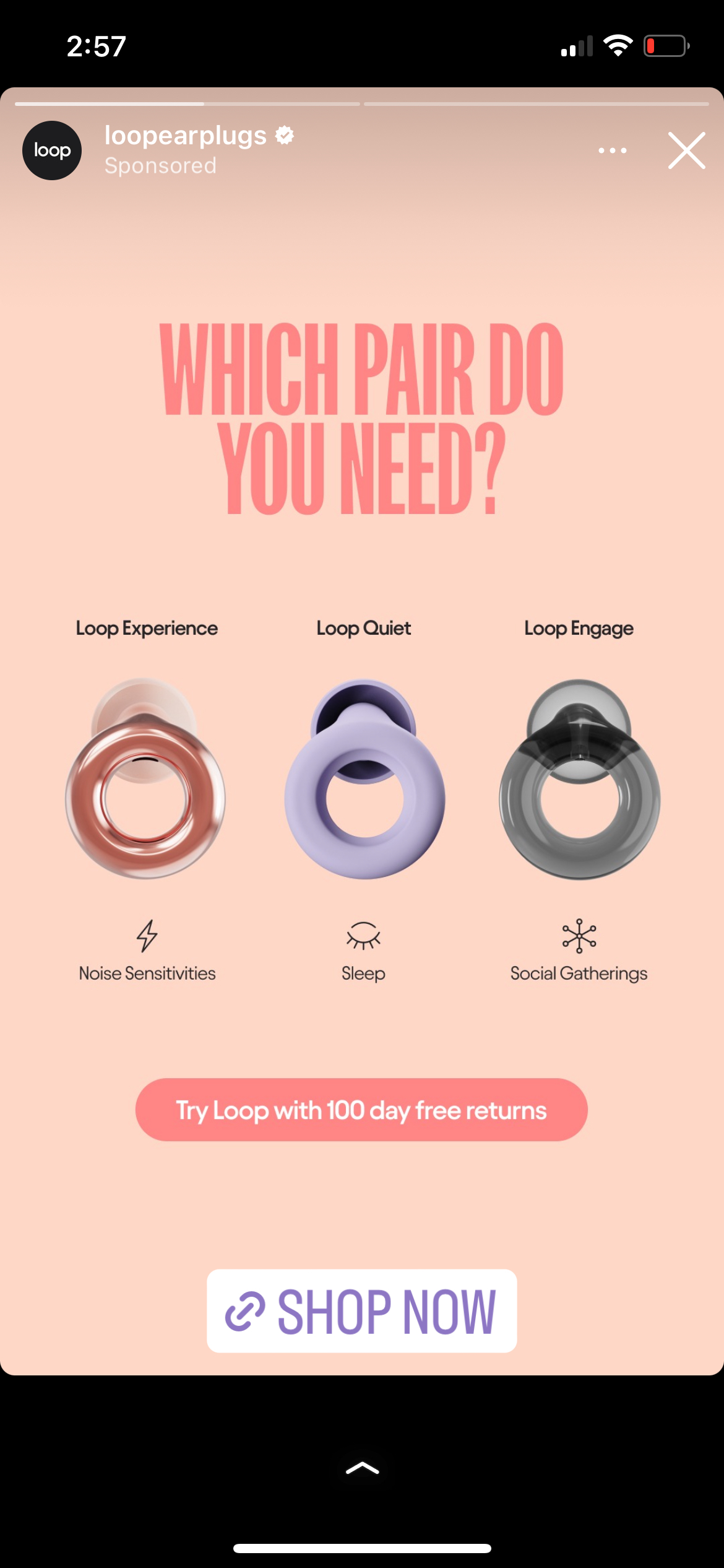
Voici une analyse détaillée de la création publicitaire pour Loop Earplugs.
1. Le Headline (Question)
2. Les 3 produits (Visuels centraux)
3. Les bénéfices/usages (Icônes + texte sous les produits)
4. L'offre de réassurance (Bouton rose "100 day free returns")
5. Le CTA final (Lien Shop Now).
"Vertical 9:16 ad visual for Instagram Stories. Minimalist layout with a soft peach gradient background. At the top, centered, display the text 'WHICH PAIR DO YOU NEED?' in large, bold, condensed pink sans-serif caps. Below, place three 3D renders of circular earplug products side-by-side. Each product has a small icon and two lines of text underneath. Product 1 (Copper): Lightning icon + 'Noise Sensitivities'. Product 2 (Purple): Closed eye icon + 'Sleep'. Product 3 (Translucent Grey): Network icon + 'Social Gatherings'. Near the bottom, a rounded pink button with the text 'Try Loop with 100 day free returns'. Clean, high-end lifestyle aesthetic."
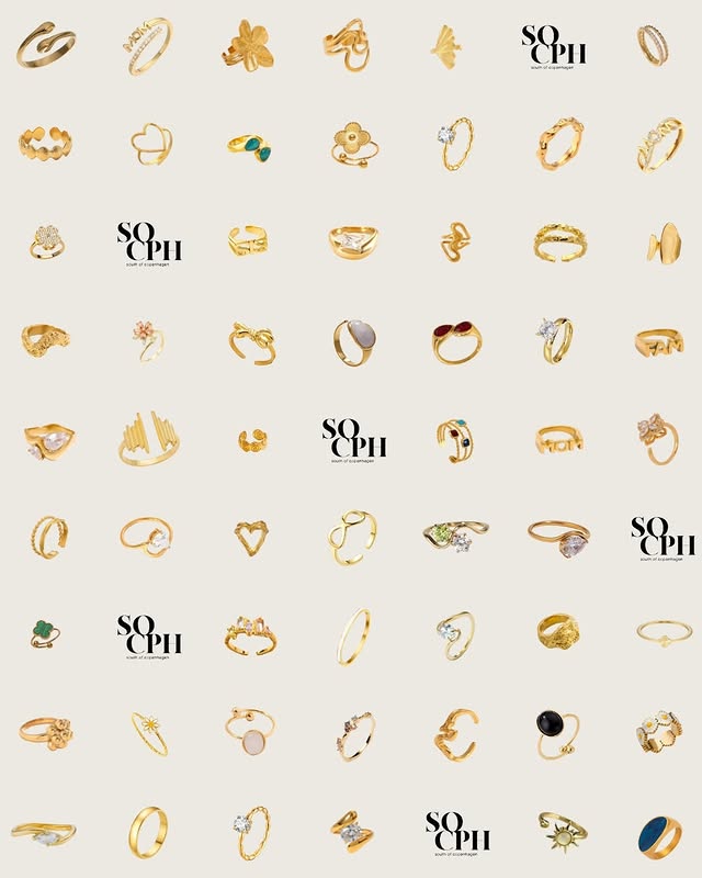
Alt det bedste, samlet ét sted🤎
Shop online på socphsmykker.dk
Voici une analyse détaillée de la création publicitaire pour SO CPH (South of Copenhagen).
---
1. L'ensemble de la grille (texture globale dorée).
2. Les logos "SO CPH" (points d'ancrage noirs qui cassent la monotonie).
3. Les détails individuels (pierres colorées, formes spécifiques des bagues).
[Promesse de valeur / Curatée]
"Alt det bedste, samlet ét sted🤎"
Technique : Simplification du choix (Paradox of choice réduit par la curation).
Réaction visée : Curiosité et soulagement ("Je vais trouver mon bonheur ici").
Hypothèse : Le spectateur cherche de la variété mais ne veut pas passer des heures à chercher.
[Appel à l'action direct]
"Shop online på socphsmykker.dk"
Technique : Direct CTA.
Réaction visée : Passage à l'acte.
[Identité de marque]
"SO CPH south of copenhagen"
Technique : Répétition de marque (Branding).
Réaction visée : Mémorisation du nom.
> "Square 1:1 ad visual at 2K resolution. A large, clean grid layout featuring 40+ different gold jewelry pieces (rings, ear cuffs, small charms) individually spaced on a warm off-white/cream background. The arrangement should look like a professional catalog. Incorporate a minimalist brand logo ('SO CPH') in black serif typography at 5-6 random positions within the grid to break the pattern. High-quality product photography with soft shadows to create depth. No human models. Palette: Gold, Cream, Black, with minor accents of emerald and sapphire stones. Text displayed: 'SO CPH'."
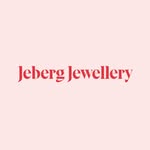
Vi designer smykker du har lyst til at tage på hver dag💛
Ikke for andres skyld - men for at føle dig hjemme i dig selv🫶🏼
Find dine favoritter på jebergjewellery.com
Voici une analyse détaillée de cette création publicitaire pour Jeberg Jewellery.
---
1. Le centre de la grille (le mannequin faisant un cœur avec ses mains).
2. Les produits isolés (les boucles d'oreilles en haut et à gauche).
3. Le logo "Jeberg Jewellery" à droite.
[Branding pur]
"Jeberg Jewellery"
Technique : Identification immédiate.
Réaction visée : Reconnaissance de marque.
Hypothèse : L'utilisateur apprécie déjà l'esthétique globale avant de lire le nom.
[Promesse de bénéfice usage]
"Vi designer smykker du har lyst til at tage på hver dag💛"
Technique : Proposition de valeur centrée sur la polyvalence.
Réaction visée : Se projeter dans un achat "rentable" et utile au quotidien.
[Pivot émotionnel / Mission]
"Ikke for andres skyld - men for at føle dig hjemme i dig selv🫶🏼"
Technique : Self-care / Individualisme positif.
Réaction visée : Sentiment de confort psychologique, empowerment personnel.
Hypothèse : La cliente achète des bijoux pour son propre plaisir, pas pour impressionner.
[CTA / Closing]
"Find dine favoritter på jebergjewellery.com"
Technique : Appel à l'action direct mais doux.
Réaction visée : Curiosité (aller voir les autres modèles).
"Square 1:1 ad visual at 2K resolution. 3x3 grid layout mimicking a minimalist Instagram feed. Central square features a model with dark hair wearing a black off-the-shoulder top, making a heart shape with her hands over her face. Other squares alternate between: 1) Close-up macro shots of silver heart-shaped earrings and necklaces on a light grey background. 2) Lifestyle shots showing the jewelry worn (back of neck, ears, hands). 3) One square with a minimalist Serif logo 'Brand Name'. Palette: Silver, charcoal black, light grey, natural skin tones. High-end lifestyle photography, soft lighting, clean and sophisticated aesthetic. Text displayed: 'Jeberg Jewellery'."
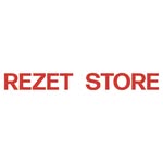
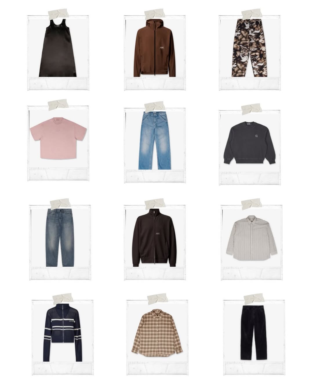
A collage of selected clothing styles from our Winter Sale - find your favorites and shop online or in store today!
Voici une analyse détaillée de la publicité Meta pour rezetstore.
1. La structure globale (la grille).
2. Les produits individuels (diversité des couleurs et formes).
3. Les détails réalistes (le scotch, le grain des photos Polaroid).
Body text (caption Meta) :
[Contexte et Bénéfice]
"A collage of selected clothing styles from our Winter Sale"
Technique : Clarté / Nouveauté
Réaction visée : Intérêt pour les bonnes affaires.
Hypothèse : L'audience connaît déjà la marque et attend les soldes.
[Appel à l'exploration]
"- find your favorites"
Technique : Personnalisation
Réaction visée : Curiosité, envie de chercher "sa" pièce.
Hypothèse : Dans une large sélection, il y a forcément quelque chose pour l'utilisateur.
[Appel à l'action / Omnicanalité]
"and shop online or in store today!"
Technique : Urgence (today) + Accessibilité
Réaction visée : Passage à l'acte immédiat (physique ou digital).
Hypothèse : L'utilisateur apprécie la flexibilité d'achat.
"Square 1:1 ad visual at 2K resolution. Layout: A clean 4x3 grid displaying 12 individual clothing items. Each item is contained within a white Polaroid-style frame with a subtle grain texture. Each frame is 'attached' to the white background by a single piece of beige masking tape at the top center. Products: Flat-lay shots of various streetwear items (jackets, pants, hoodies, shirts). Palette: Dominant earth tones (brown, tan, cream) mixed with blue denim and charcoal, including one pop of soft pink. Typography: None on the main image, except for tiny, technical-looking serial numbers at the bottom of the Polaroid frames. Style: Clean, minimalist mood board aesthetic with soft shadows to create a 3D effect of the photos pinned to a wall."
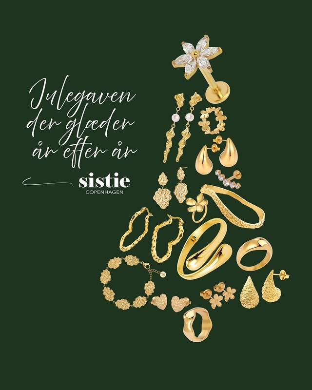
Hun ønsker sig Sistie. Trust us ❤️🎄🎁
Voici une analyse détaillée de la publicité Meta pour la marque Sistie Copenhagen.
---
1. La forme globale du sapin (concept).
2. Le texte manuscrit en haut à gauche (contexte émotionnel).
3. Le logo "Sistie" au centre (identification de marque).
"Julegaven der glæder år efter år"
"sistie COPENHAGEN"
"Hun ønsker sig Sistie."
"Trust us ❤️🎄🎁"
"Portrait 4:5 (ou Square 1:1) ad visual at 2K resolution. Layout: A Christmas tree shape formed by an arrangement of various gold jewelry items (rings, earrings, bracelets, necklaces) centered on the right side. On the top left, elegant handwritten text. Typography: A mix of a fluid, organic script for the headline and a sophisticated Serif for the logo. Palette: Deep forest green background (#1a2e1a) with bright polished gold products. Text displayed: 'Julegaven der glæder år efter år' and the logo 'sistie COPENHAGEN'. Style: High-end product photography composite with clean lighting and soft shadows to create depth."


Our Black Friday goes live on Tuesday 25 November 5PM GMT - items will be on sale ranging from 20-70% off. New products & items from older collections also on site
Sign up online to gain early access ✔️
This is where my mornings start (and sometimes end) 💙
---
Voici une analyse détaillée de cette publicité vidéo pour un canapé modulaire (style "Cloud Sofa" ou "Modular Pit").
---
⏱ 0-3s HOOK :
⏱ 3-10s PROBLÈME/SETUP :
⏱ 10-15s SOLUTION/PROOF :
⏱ Fin CTA :
---
[Hook d'impact physique]
"Action : Saut dans le canapé"
Technique : Démonstration de bénéfice immédiat (confort extrême).
Réaction visée : Effet "Wow", envie de ressentir la même sensation de mollesse.
Hypothèse sous-jacente : Le spectateur est fatigué ou cherche un confort supérieur à son canapé actuel.
[Preuve de modularité / Facilité]
"Action : Manipulation des structures métalliques et des blocs"
Technique : Transparence du produit (Behind the scenes).
Réaction visée : "C'est simple à installer et je peux configurer ma pièce comme je veux."
Hypothèse sous-jacente : Le spectateur craint que les meubles XXL soient difficiles à monter ou trop encombrants.
[Validation de l'échelle]
"Action : Elle s'allonge de tout son long et il reste de la place"
Technique : Comparaison d'échelle humaine.
Réaction visée : "C'est immense, on peut y tenir à plusieurs ou vraiment s'étaler."
Hypothèse sous-jacente : Le spectateur se sent souvent à l'étroit sur son mobilier actuel.
[Projection Lifestyle / Esthétique]
"Action : Ajout d'un plaid rose et d'une boisson"
Technique : Transfert de sentiment (Cozy vibes).
Réaction visée : Désir d'appartenance à ce mode de vie calme et luxueux.
Hypothèse sous-jacente : Le spectateur achète une ambiance, pas seulement un tas de mousse.
---
---
---

🎯🛍️ POV: Your Target run just got way better—our candles are now online! Add to cart, skip the line, and let the good vibes come to you, babes 💕🕯️💕
---
Voici une analyse détaillée de cette publicité vidéo pour les bougies Candier, distribuées chez Target.
---
⏱ 0-3s HOOK :
⏱ 3-6s PROBLÈME/SETUP :
⏱ 6-18s SOLUTION/PROOF :
⏱ Fin CTA :
---
[Preuve de légitimité / Reality Check]
"Bougie physique tenue devant l'écran Target"
[Facilité d'accès / Navigation]
"Saisie du nom de la marque dans la barre de recherche Target"
[Variété et Personnalisation]
"Affichage de plusieurs modèles (Congrats, Love you more than ice cream)"
[Le 'Wow' Factor / Détail produit]
"Gros plan sur la bougie 'The Final Rose' avec la fleur sculptée"
---
---
---