Everything You Need From Food. 1 Meal.
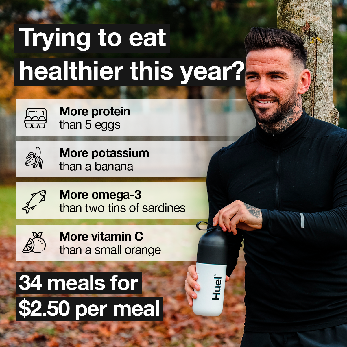
Trying to eat healthier this year? <br /> <br /> Huel makes it so easy to eat delicious, 100% nutritious food without spending hours planning, prepping, or cooking. Just add water, shake or stir, and you're good to go. <br /> <br /> 🥚Know you're getting enough protein in your diet<br /> 💪Reduce tiredness and fatigue with 27 essential vitamins & minerals like iron<br /> 🥣Easy portion control<br /> ⏰Ready in 5 min<br /> <br /> Get 34 meals for as little as $2.50 per meal, plus a FREE T-shirt + shaker if you're a new customer!
🧠 Modélisation Gemini 3 Flash
Voici une analyse détaillée de cette création publicitaire pour Huel.
---
1. PREMIÈRE IMPRESSION (capture d'attention)
- Ce qui attire l'œil en PREMIER : Le bloc de texte en haut à gauche "Trying to eat healthier this year?" sur fond noir contrasté, ainsi que les icônes illustrées (œufs, banane, poisson).
- Le scroll-stop : Huel utilise ici la comparaison nutritionnelle visuelle. Au lieu de donner des chiffres abstraits (grammes), ils comparent leur produit à des aliments entiers familiers. Cela crée un "choc cognitif" : "Comment un shake peut-il battre 5 œufs ET une banane ET des sardines ?"
- Hiérarchie visuelle :
1. La question (Headline accroche)
2. Les 4 lignes de bénéfices avec icônes (Preuve nutritionnelle)
3. L'offre de prix en bas à gauche (Conversion/Accessibilité)
4. Le personnage et le produit à droite (Humanisation et branding)
2. EXÉCUTION BRANDING
- ADN de la marque : Expert & Accessible. C'est le "repas du futur" pour les gens actifs. Ce n'est pas du luxe, c'est de l'optimisation.
- Exécution concrète :
- Typographie : Sans-serif grasse et moderne, très lisible, évoquant l'efficacité.
- Couleurs : Noir et blanc (code couleur historique de Huel) pour le côté sérieux/minimaliste, sur un fond naturel pour rappeler l'origine végétale.
- Mise en scène : Un homme athlétique, tatoué, souriant mais "vrai" (pas un bodybuilder pro en studio), ce qui rend la marque accessible à l'homme actif lambda.
- Produit : Le shaker est central, blanc et noir, avec le logo bien visible.
3. CHUNKING DU COPY
Headline principal (dans l'image)
- Chunk 1 : "Trying to eat healthier this year?"
- Label : Question rhétorique basée sur la saisonnalité (New Year Resolution).
- Technique : Pied-dans-la-porte (OUI psychologique).
- Réaction visée : "Oui, c'est mon cas."
- Hypothèse : Le spectateur se sent un peu coupable de ses excès passés ou cherche une solution simple.
Liste de bénéfices (dans l'image)
- Chunk 2 : "More protein than 5 eggs" | Technique : Benchmarking alimentaire | Réaction : Impression de puissance/satiété.
- Chunk 3 : "More potassium than a banana" | Technique : Déconstruction de mythe | Réaction : "Je n'ai pas besoin de manger 3 fruits."
- Chunk 4 : "More omega-3 than two tins of sardines" | Technique : Argument santé/praticité | Réaction : Soulagement (pas d'odeur de poisson).
- Chunk 5 : "More vitamin C than a small orange" | Technique : Complétude nutritionnelle | Réaction : Sentiment de sécurité immunitaire.
Offre (dans l'image)
- Chunk 6 : "34 meals for $2.50 per meal"
- Label : Ancrage de prix.
- Technique : "Reframing" (décomposer le prix total en coût par repas pour paraître dérisoire).
- Réaction : "C'est moins cher qu'un fast-food."
Body text (caption Meta)
- Chunk 7 : "Huel makes it so easy to eat delicious, 100% nutritious food without spending hours planning, prepping, or cooking." | Label : Solution au "Pain Point" (manque de temps).
- Chunk 8 : "Get 34 meals for as little as $2.50 per meal, plus a FREE T-shirt + shaker if you're a new customer!" | Label : Offre irrésistible (Low barrier to entry).
4. COMPOSITION & DESIGN
- Layout : Division verticale. Gauche = Rationnel (données, texte, prix). Droite = Émotionnel (humain, usage, nature).
- Palette : Noir, blanc, beige crème (fond des textes) et couleurs d'automne en arrière-plan. Le beige adoucit le contraste noir/blanc pour ne pas paraître trop "médical".
- Style : Photo réelle (Lifestyle) avec overlay graphique propre.
- Typographie : Sans-serif type Helvetica/Inter. Très "Tech" et propre.
5. ANGLE MARKETING
- Angle principal : L'Optimisation / Le Gain de temps. On vend la santé sans l'effort de la cuisine.
- Ton général : Direct, factuel et rassurant.
- Cible : Hommes actifs (25-45 ans), sportifs ou professionnels urbains qui sautent des repas ou mangent mal par manque de temps.
6. BRIEF DE RÉPLICATION
> "Square 1:1 ad visual at 2K resolution. Split layout: Right side features a fit, smiling man in athletic black gear outdoors holding a branded shaker. Left side features a clean, high-contrast text layout. Top headline: 'Trying to eat healthier this year?' in bold white text on a black block. Below, a list of 4 nutritional comparisons (Protein/Eggs, Potassium/Banana, Omega-3/Sardines, Vitamin C/Orange) using minimalist line-art icons and a light beige background for each line. Bottom left corner: A black call-out box with white text '34 meals for $2.50 per meal'. Style: Professional lifestyle photography with clean graphic overlays. Palette: Black, White, Beige, and natural outdoor tones."
7. VERDICT
- Hook visuel efficace ? Oui. La comparaison avec les œufs et la banane est un classique de l'infographie qui fonctionne toujours car elle est instantanément compréhensible.
- Point fort : L'ancrage du prix ($2.50) qui lève immédiatement l'objection "la nourriture saine coûte cher".
- Point faible : Le texte est un peu dense. Sur un petit écran de téléphone, les lignes du bas pourraient être difficiles à lire en un coup d'œil.
- Score qualité globale : 9/10. C'est une publicité "fond de funnel" extrêmement performante qui mixe preuve sociale, rationalité et offre irrésistible.