

Don’t let the cold keep you inside. With winter essentials like these, you can hit your goals then hit the town in style.
Fashionsecurity 9achievement 7esteem 6
🔗 https://www.gymshark.com/collections/essentials/womens
Le format PSY — ENGAGEMENT se définit par une volonté de briser la résistance publicitaire en mimant des contenus organiques, éditoriaux ou personnels (UI Mockup, lifestyle premium, UGC). Sa force psychologique réside dans le contraste immédiat (Avant/Après, Chaos/Ordre) et l'utilisation de biais cognitifs comme la preuve sociale ou l'autorité pour transformer un désir esthétique en achat rationnel.
---
| Pattern hook | Occurrences | Exemples verbatim |
|---|---|---|
| Bénéfice émotionnel direct | 1 | "BUCKET FULL OF HAPPINESS" |
| Preuve sociale / Best-seller | 1 | "Our best-selling sheets" |
| Comparaison binaire (Pain vs Solution) | 1 | "BIG OLD WALLET." vs "RIDGE WALLET." |
| Liste personnelle (Témoignage) | 1 | "Reasons I use Cerebral:" |
| Provocation / Curiosité intense | 1 | "Unbelievable! Here's how I lost weight without sacrificing sweet snacks!" |
---
| Angle | Occurrences | Quand l'utiliser |
|---|---|---|
| Gain émotionnel & Esthétique | 1 | Pour des produits "plaisir" où le visuel prime (mode, déco). |
| Luxe accessible & Bien-être | 1 | Pour rassurer sur la qualité premium tout en vendant un bénéfice santé/confort. |
| Expert / Tech-Premium (Efficacité) | 1 | Pour des produits innovants qui résolvent un problème d'encombrement ou d'usage. |
| Commodité (Frictionless) | 1 | Pour des services digitaux où la simplicité d'accès est le frein n°1. |
| Plaisir sans culpabilité (Guilt-free) | 1 | Pour l'alimentaire "healthy" qui doit prouver son goût face aux alternatives. |
---
---
---
---
1. Le pattern "Apple Notes" : Pour un service ou un produit complexe, lister 5 bénéfices simples dans un mockup de l'application "Notes". C'est le meilleur levier d'engagement actuel pour réduire la fatigue publicitaire.
2. La métaphore visuelle du problème : Si votre produit remplace une alternative médiocre, montrez cette alternative de façon absurde (ex: manger du carton pour des céréales saines). Le contraste visuel arrête le scroll.
3. L'ancrage "Best-Seller" : Ne vendez pas juste le produit, vendez le fait que "tout le monde change pour lui". Utilisez la structure : [Nom de la marque] + [Preuve sociale : Best-seller/Viral] + [Bénéfice fonctionnel].
Don’t let the cold keep you inside. With winter essentials like these, you can hit your goals then hit the town in style.


"Silk Is Here to Help Your Skin (and Hair, and Sleep...)" - GoodHousekeeping
🎁 "The perfect gift" - Glamour Magazine
⭐ Featured on Oprah Magazine, GoodHousekeeping, Allure, Glamour, Prevention, Byrdie, Popsugar, PureWOW, HGTV & More
🌸 The best kept secret of dermatologists
💫 Ultra premium 22-Momme 6A Grade silk
⭐ Over 80,000 5-Star Reviews
"I Started Sleeping With Blissy’s Silk Products, and My Hair and Skin Have Never Looked Better" - Allure
Limited supplies - Up To 45% Off

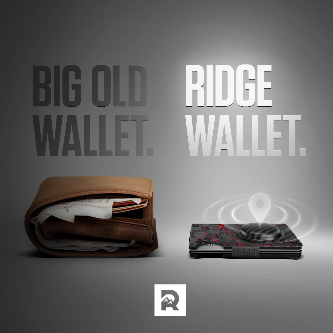
Check out the Top 5 Reasons why men everywhere are switching to The Ridge Wallet.
Voici une analyse détaillée de la publicité pour The Ridge, basée sur le visuel et les informations fournies.
---
1. Le produit éclairé (Ridge Wallet) avec l'icône de localisation brillante.
2. Le texte massif en haut ("BIG OLD WALLET." vs "RIDGE WALLET.").
3. Le vieux portefeuille sombre et encombrant.
4. Le logo "R" centré en bas pour la mémorisation de marque.
Note : Je me base sur le texte réellement visible dans l'image et la caption fournie.
Chunk 1 :
"BIG OLD WALLET."
Chunk 2 :
"RIDGE WALLET."
Chunk 3 :
"Check out the Top 5 Reasons why men everywhere are switching to The Ridge Wallet."
Chunk 4 :
"SHOP NOW"
"Square 1:1 ad visual at 2K resolution. A side-by-side comparison layout. Left side: a thick, messy, overstuffed brown leather wallet filled with crumpled receipts and cards, dimly lit in shadows. Right side: a sleek, slim carbon fiber minimalist wallet (Ridge style) with red accents, brightly illuminated with a glowing white spotlight from above. Above the modern wallet, a holographic 3D location pin icon with concentric signal waves (AirTag style). Text displayed: 'BIG OLD WALLET.' on the top left and 'RIDGE WALLET.' on the top right in massive, bold, metallic sans-serif typography. Background is a neutral dark grey studio gradient. Professional product photography style, high contrast. Brand logo (a stylized R) centered at the very bottom in a white square."


Our prenatal multivitamin experience just got even fresher. You can now choose the scent of your essential oil infused tab—citrus or mint.


Dress less dad and more daddy

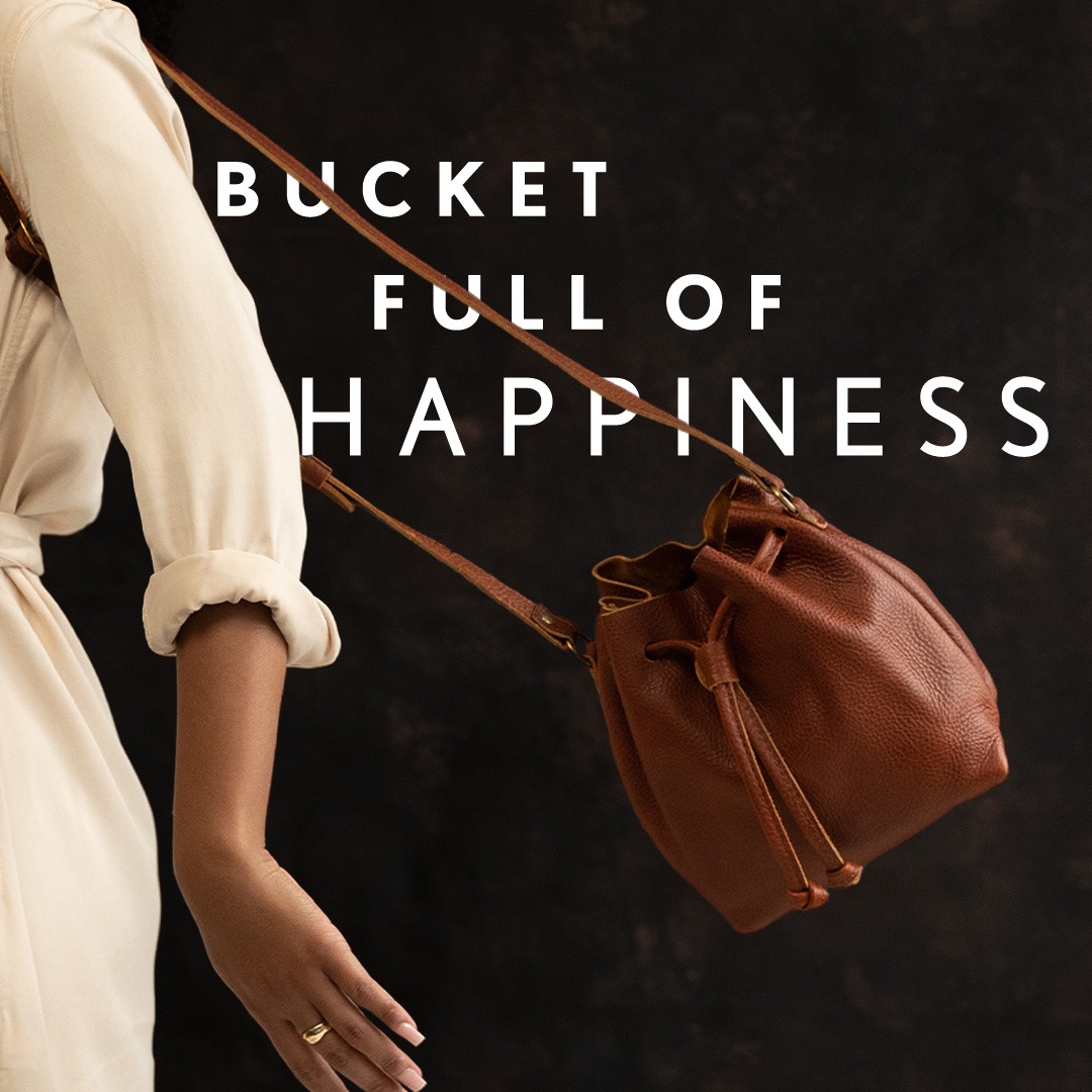
Featuring a relaxed leather drawstring opening, allowing plenty of space to carry all of your essentials, and a sleek inside pocket.
Voici une analyse détaillée de cette publicité pour Portland Leather Goods.
---
1. Le Produit : Le sac se détache grâce à l'éclairage latéral (rim light).
2. Le Headline : Le texte "BUCKET FULL OF HAPPINESS" au centre de la zone sombre.
3. Le Modèle : Le bras et la tenue crème qui encadrent l'image à gauche.
> "BUCKET FULL OF HAPPINESS"
> "Featuring a relaxed leather drawstring opening, allowing plenty of space to carry all of your essentials, and a sleek inside pocket."
> "SHOP_NOW"
---
Note : Les métadonnées mentionnent un titre "BIG Discounts Today", mais celui-ci n'apparaît pas visuellement sur l'image analysée. L'image privilégie l'émotion à la promotion.
"Square 1:1 ad visual at 2K resolution. Layout: A lifestyle shot featuring a model from the shoulder down, wearing a neutral cream-colored outfit on the left third of the frame. A cognac brown pebbled leather bucket bag hangs diagonally across the center. Background: Moody, dark textured studio background (charcoal or dark brown). Typography: Bold white sans-serif font, all caps, with wide letter spacing. Text displayed: 'BUCKET FULL OF HAPPINESS'. Lighting: Soft side-lighting to highlight the texture of the leather. Style: High-end boutique photography, minimalist and elegant."

"Why would you ever eat regular cereal again?"<br /> 💪 13g of protein<br /> ❤️ 4g net carbs and 0g sugar<br /> 🥣Tastes like your childhood favorites<br /> ✨ Perfect for low carb or Keto lifestyles<br /> 💸 Less than $2 per serving<br /> ✅ Satisfaction guaranteed
---
Voici une analyse détaillée de la publicité pour Magic Spoon, réalisée selon ton protocole d'expert.
---
⏱ 0-3s HOOK :
⏱ 3-10s PROBLÈME/SETUP :
⏱ 10-30s SOLUTION/PROOF :
⏱ Fin CTA :
---
[Accroche par le bénéfice ultime]
"Unbelievable! Here's how I lost weight without sacrificing sweet snacks!"
[Métaphore visuelle du problème]
"I've tried some healthier cereals... but they honestly tasted like cardboard."
[Preuve sociale (Social Proof)]
"I saw a ton of people on TikTok talking about Magic Spoon."
[Ancrage nostalgique]
"This cereal brought me back to my childhood."
[Justification logique (Features)]
"Loaded with protein... only 4g net carbs... ZERO grams of sugar."
[Validation par le goût]
"Did I mention it's KETO-friendly? I'd call that a game-changer!"
---
---
---

These sheets aren't just soft, they're temperature-regulating and come with a 100 night trial and lifetime warranty. Sleep at your ideal temperature 🛏
Voici une analyse détaillée de la publicité Cozy Earth.
---
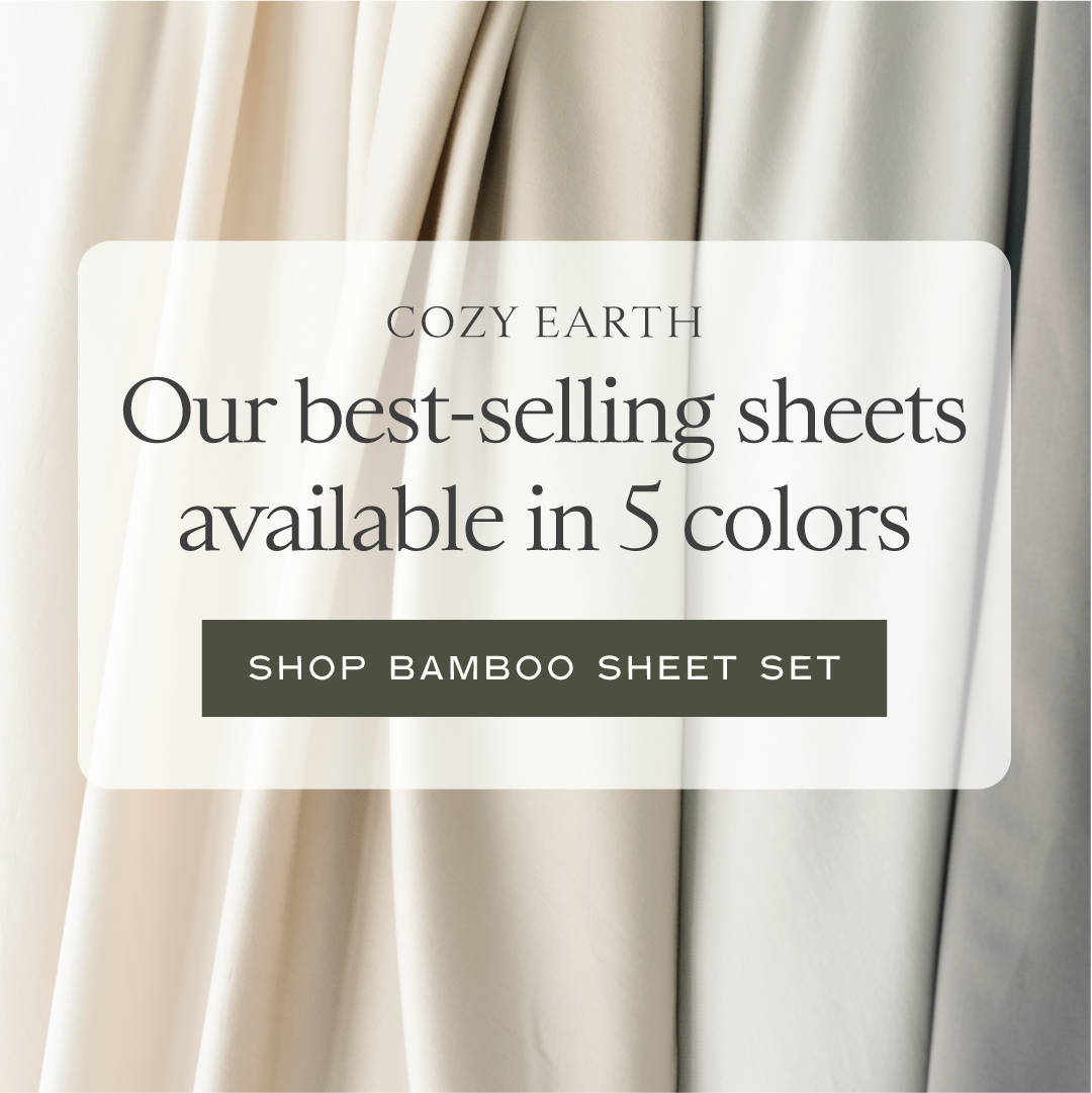
1. Le dégradé de couleurs des tissus en arrière-plan (le produit).
2. Le bloc central blanc (le focus).
3. La mention "5 colors" (l'argument de choix).
4. Le bouton d'appel à l'action (le passage à l'achat).
"Square 1:1 ad visual at 2K resolution. Centered layout with a semi-transparent white rounded rectangle overlay. Background features high-quality, close-up macro photography of draped, folded fabric sheets in a gradient of 5 neutral colors (off-white, cream, beige, light sage, and soft grey). Typography: Elegant Serif for the headline. Palette: Earthy neutrals with a dark olive green call-to-action button at the bottom of the box. Text displayed: 'COZY EARTH' in small caps, 'Our best-selling sheets available in 5 colors' as the main headline, and 'SHOP BAMBOO SHEET SET' inside the button. Style: Clean, minimalist, premium home decor aesthetic."

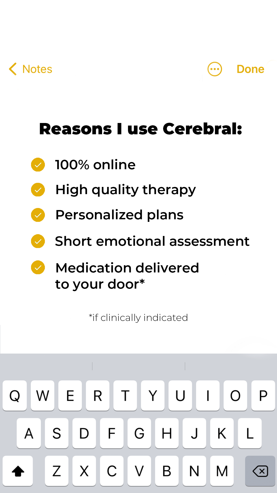
Better days are on the way. ⛅️ Cerebral's skilled providers offer expert help for anxiety, depression, insomnia & more. . 👉Signup now👈
Voici une analyse détaillée de la publicité Meta pour Cerebral.
---
1. Le titre en gras "Reasons I use Cerebral:".
2. La liste à puces (checkmarks jaunes) qui guide la lecture de haut en bas.
3. Le clavier en bas qui renforce l'illusion de l'application réelle.
> "Square 1:1 ad visual at 2K resolution. High-fidelity mockup of the Apple iOS Notes app interface. Top navigation shows 'Notes' in yellow on the left and 'Done' on the right with a triple-dot icon. Center content features a bold header 'Reasons I use [BRAND NAME]:' followed by a checklist of 5 items with yellow circular checkmarks. The bottom third of the image features a realistic iOS keyboard. Palette: Off-white background, black text, and specific yellow (#FFCC00 approx) for accents. Style: Clean, UI-focused, no human subjects. Minimalist and modern aesthetic."


The One Product I Use Everyday Without Fail, Is Future Kinds Essential Multivitamin 🚀 🌱