

Take the quiz
Treat yourself to a wellness routine that works! Find your product match with our 1-question quiz:
BeautyHealth/Wellnesssecurity 9nurturance 8curiosity 7
🔗 https://lovewellness.com/pages/new-year-new-you-2023
Ce format repose sur le voyeurisme digital : le cerveau humain est programmé pour lire les notifications et les messages privés par réflexe. En imitant des interfaces familières (iMessage, WhatsApp), la publicité court-circuite la résistance naturelle aux annonces ("ad blindness") et simule une recommandation de pair à pair, instaurant une confiance immédiate.
Les hooks dans ce format se divisent entre l'affirmation choc et l'émotion brute.
| Pattern hook | Occurrences | Exemples verbatim |
|---|---|---|
| Le paradoxe temporel (chiffre précis) | 5 | "Turns out my ideal bedtime is actually 2am lol" / "9:37pm" |
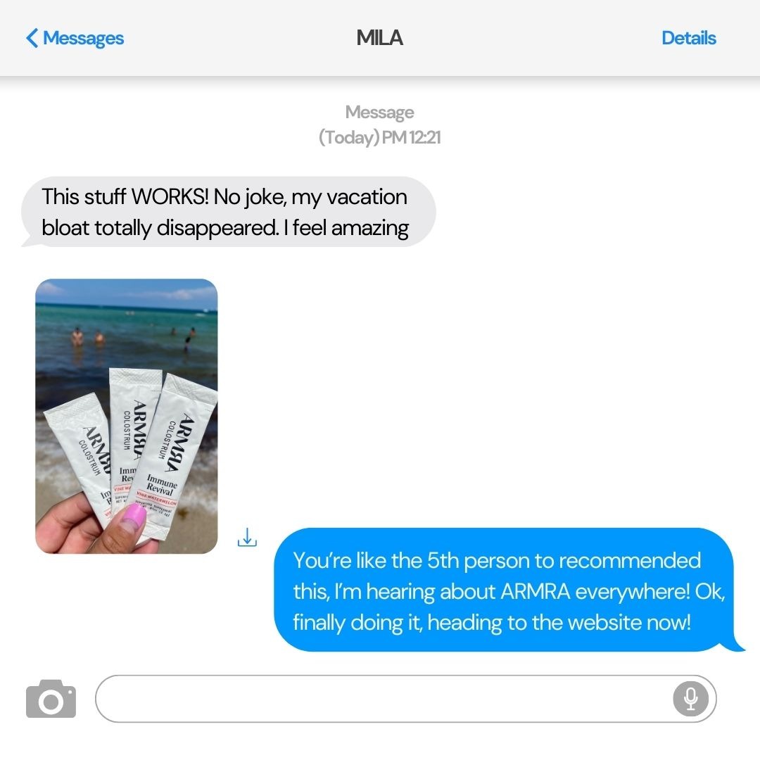
| L'enthousiasme extrême | 3 | "This stuff WORKS! No joke" / "This is the best gift EVERRR!!!" |
| Le cri de détresse / vulnérabilité | 2 | "Send help!!" / "I think I'm finally ready to get help" |
| La curiosité / teasing "Bestie" | 2 | "You have to see this! 😍" / "Guys, Rise told me..." |
| L'interjection vulgaire / choc | 1 | "Holy f\ck"* (FFUPs) |
L'angle est le moteur psychologique derrière la conversation.
| Angle | Occurrences | Quand l'utiliser |
|---|---|---|
| Validation sociale (Hype) | 6 | Pour prouver qu'un produit est viral ("5th person to recommend this"). |
| Déculpabilisation (Paradoxe) | 4 | Pour casser un dogme ou une norme sociale ("Coucher à 2h du mat"). |
| Gain de performance / Énergie | 4 | Pour vendre un résultat concret ("Killin' it at work", "Focus"). |
| Réduction de douleur (Pain Point) | 3 | Pour cibler un symptôme précis ("Bloat", "Tired", "Alcoholism"). |
| Urgence promotionnelle | 2 | Pour annoncer une vente via un canal "privé" ("Pre-Black Friday Sale"). |
1. Le Sceptique vs L'Initié :
2. Le "Peer-to-Peer" direct :
3. L'Aveu de vulnérabilité :
lol, 🥰, 🔥, 😍.1. Le Pattern "Paradoxe UI" : Créer une bulle iMessage avec une affirmation qui va à l'encontre de la pensée commune sur votre produit (ex: "Je mange plus de gras et j'ai perdu 2kg lol"). Utiliser le mode sombre pour l'aspect "secret".
2. Le Pattern "Validation entre pairs" : Simuler une conversation WhatsApp où un client envoie une photo UGC de son colis ouvert avec le message : "Best gift EVERRR!!!". C'est redoutable pour l'E-commerce de cadeau/bijoux.
3. Le Pattern "Traitement d'objection par chat" : Faire poser la question que tout le monde se pose par le "Sceptique" dans la bulle grise (ex: "C'est pas trop cher ?" ou "Ça marche vraiment ?") et répondre par le bénéfice ultime dans la bulle bleue.
Treat yourself to a wellness routine that works! Find your product match with our 1-question quiz:

Get to know Gut Feelings Probiotics, one of our Love Yourself Well essential probiotics! Leave a 💚 if you’ve tried it out!
---
Voici une analyse détaillée de la publicité pour Love Wellness - Gut Feelings Probiotics suivant ton process d'expert.
---
⏱ 0-3s : HOOK
⏱ 3-9s : PROBLÈME/SETUP
⏱ 9-17s : SOLUTION/PROOF
⏱ 17-19s : CTA (Fin)
---
[Accroche Esthétique & Produit]
"Visuel d'une main touchant une gélule devant un flacon Gut Feelings Probiotics"
[Mission de Marque & Positionnement]
"Why We Made Gut Feelings Probiotics: Everyone deserves better digestion"
[Argument d'Autorité de Niche]
"Support their Gut-Brain-Vagina Axis"
[Preuve de Qualité / Ingrédients]
"Clinically studied Prebiotics and probiotics (...) Our Floradapt™ Gut Comfort blend"
[Éducation & Identification des agresseurs]
"Bacteria (...) otherwise struck down by stress, over-the-counter medications, junk food, caffeine, and happy hour."
---
---
---
Conseil d'expert : Cette pub fonctionnerait encore mieux en testant une version où les fenêtres apparaissent plus lentement pour laisser le temps de lire, ou en surlignant en gras les mots clés (Stress, Junk Food, Vagina).

Do you know the signs of alcohol dependency? 🤔 If you think you may have a problem, Cerebral's experts are here for you.
Voici une analyse détaillée de cette création publicitaire pour Cerebral.
---
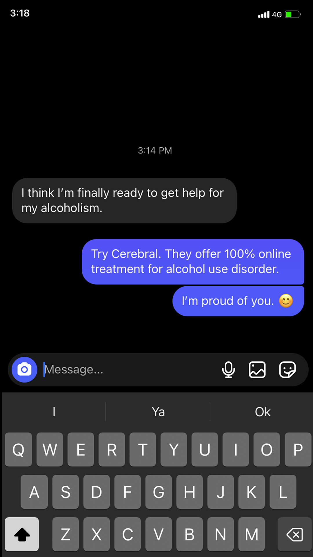
1. La bulle grise (aveu de vulnérabilité) : "I think I’m finally ready..."
2. La bulle bleue (la recommandation) : "Try Cerebral..."
3. Le clavier et l'interface iOS (confirmation du contexte familier et quotidien).
[L’Aveu / Le Problème]
"I think I’m finally ready to get help for my alcoholism."
[La Solution / Le Produit]
"Try Cerebral. They offer 100% online treatment for alcohol use disorder."
[Validation Émotionnelle]
"I’m proud of you. 😊"
---
[Accroche interrogative]
"Do you know the signs of alcohol dependency? 🤔"
[Promesse d'assistance]
"If you think you may have a problem, Cerebral's experts are here for you."
---
[Promesse de valeur]
"100% Virtual Care | Get Personalized Care"
[Action]
"Learn More" (CTA)
> "Square 1:1 or Vertical 4:5 ad visual at 2K resolution. Layout: A realistic smartphone screenshot of an iMessage/SMS conversation in Dark Mode. UI Elements: Top status bar (time, 4G, battery), bottom iOS keyboard visible with predictive text ('I', 'Ya', 'Ok'). Color Palette: Deep black background, standard iOS blue for outgoing bubbles, light grey for incoming. Text displayed: Grey bubble: 'I think I’m finally ready to get help for my alcoholism.' Blue bubbles: 'Try Cerebral. They offer 100% online treatment for alcohol use disorder.' followed by 'I’m proud of you. 😊'. Style: High-fidelity mobile UI mockup, no photography, strictly text-based conversation interface."

Kiss goodbye to bloating, constipation, and feeling slow and heavy. And forget the band-aid solutions. These are signs of underlying gut barrier imbalance - solve the root issue and feel lighter with lasting results.
Meet ARMRA - the research-backed colostrum superfood with over 200+ functional, bioactive nutrients that is nature’s unrivaled gut powerhouse. It seals the complete gut barrier for real results you can feel.
🔸 repair the gut wall
🔸 reactivate metabolic pathways
🔸 replenish the microbiome
🔸 block irritants that trigger IBS
We keep selling out for a reason. Try ARMRA and feel the difference for yourself risk-free!

Voici une analyse détaillée de la publicité pour MADMONQ.
---
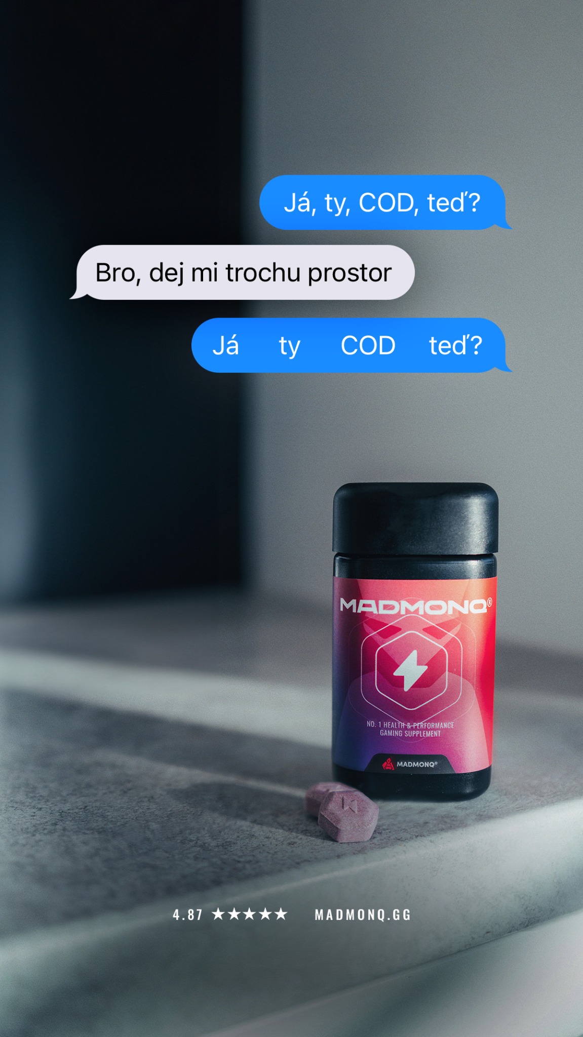
1. Les bulles de texte (lecture du dialogue).
2. Le produit (pot noir et rouge MADMONQ) et les deux pastilles.
3. Les éléments de preuve sociale et l'URL en bas.
[Accroche / Mise en situation]
"Já, ty, COD, teď?"
[Objection / Setup de la blague]
"Bro, dej mi trochu prostor" (Bro, donne-moi un peu d'espace)
[Punchline visuelle]
"Já ty COD teď?"
[Social Proof]
"4.87 ★★★★★"
[Destination]
"MADMONQ.GG"
"Portrait 9:16 ad visual. Top section features a smartphone chat interface with three bubbles. Text in bubbles: 1. 'Já, ty, COD, teď?' (Blue), 2. 'Bro, dej mi trochu prostor' (White), 3. 'Já [wide spaces] ty [wide spaces] COD [wide spaces] teď?' (Blue). Bottom right features a sleek black and red supplement bottle labeled 'MADMONQ' on a grey concrete-like surface. Two purple hexagonal pills are placed next to the bottle. Cinematic lighting with soft shadows. Bottom center displays '4.87 ★★★★★' and 'MADMONQ.GG' in white minimalist font."

MADMONQ® supplements, your trusted sidekicks for success, focus and health 🧠
Voici une analyse détaillée de la création publicitaire MADMONQ selon ton processus.
---
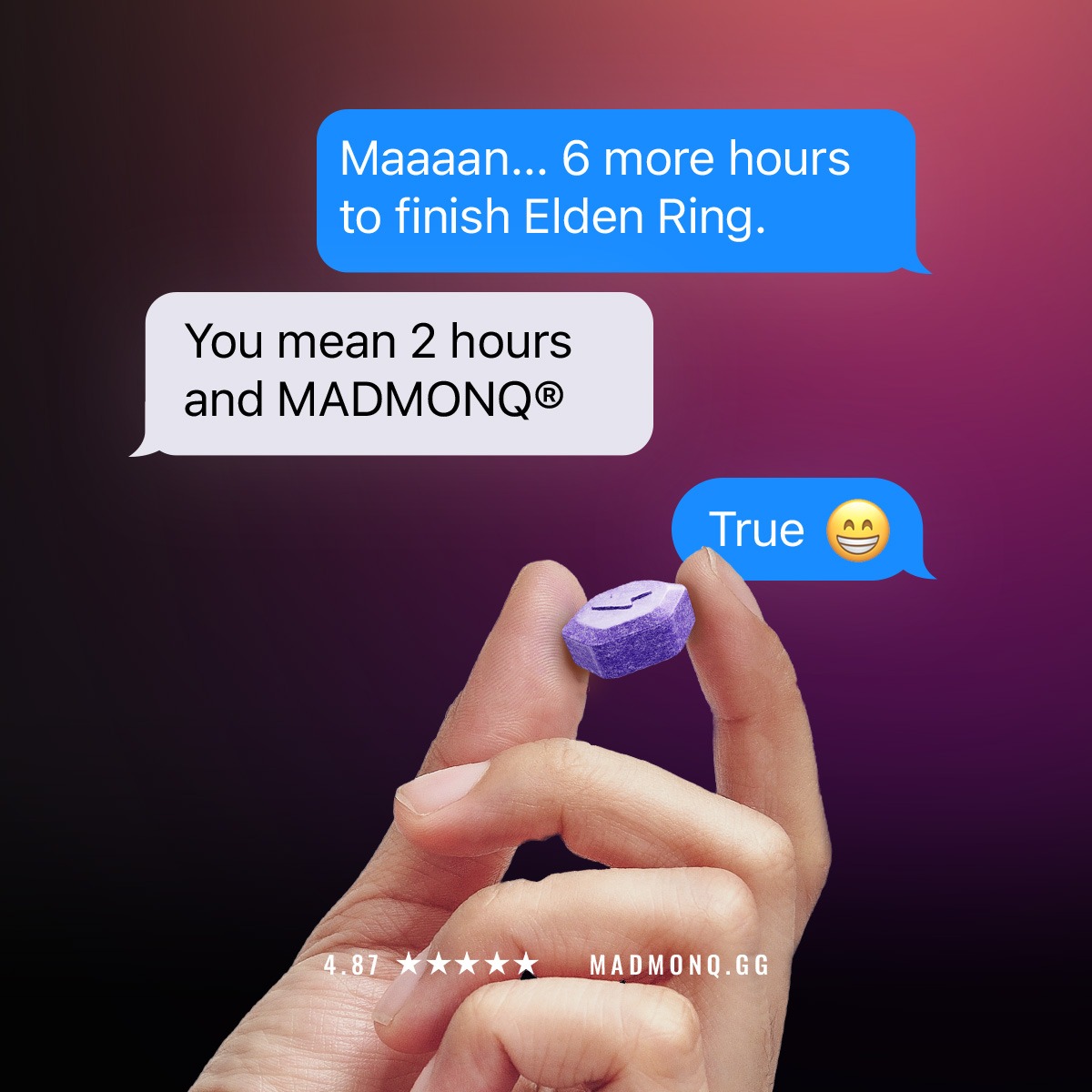
1. Le fil de discussion (en haut).
2. Le produit (la pilule violette tenue entre les doigts).
3. La preuve sociale et l'URL (en bas).
"Square 1:1 ad visual at 2K resolution. Layout: The top half features an iMessage conversation style UI on a dark purple gradient background. Typography: Standard iOS system font for the bubbles. Text displayed in bubbles: Blue bubble: 'Maaaaan... 6 more hours to finish Elden Ring.', Gray bubble: 'You mean 2 hours and [BRAND NAME]®', Blue bubble: 'True 😄'. Visual: In the foreground, a close-up photo of a hand holding a single hexagonal purple supplement pill between the thumb and index finger. At the bottom, add a small footer with '4.87 ★★★★★' and the website URL. Style: High-quality photo of the product mixed with clean digital UI overlays. Palette: Deep purple, vibrant blue, and dark magenta gradients."


"HOLDEN makes custom rings that are completely unique and a fraction of the price compared to their designer counterparts." - BRIDES Magazine

Level-up your productivity. Jewellery for the modern independent.
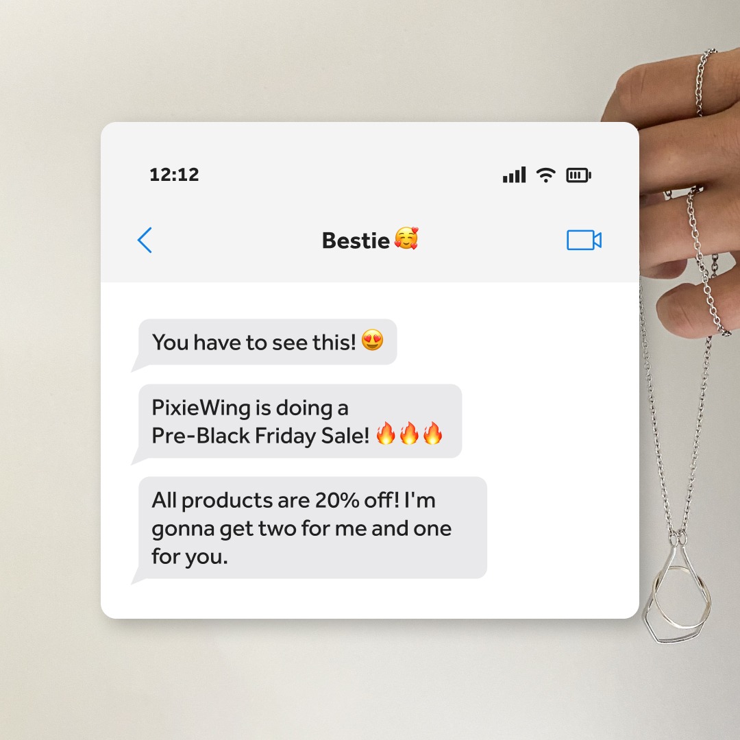
Voici une analyse détaillée de la créa publicitaire pour Pixie Wing.
---
1. Le nom du contact "Bestie 🥰" (crée une connexion émotionnelle immédiate).
2. Les bulles de texte (le message de vente).
3. Le produit tenu à droite (le collier "ring-keeper") qui donne le contexte de l'offre.
🥰, 😍, 🔥) renforce le côté décontracté et amical ("Bestie")."Square 1:1 ad visual at 2K resolution. The layout features a realistic iOS iMessage conversation window centered-left on a clean, off-white background. On the right side, a close-up of a hand holds a silver 'ring keeper' necklace, showing the functional loop. Typography: Use San Francisco (Apple system font) for the chat bubbles. Palette: Neutral whites, light greys, and metallic silver, with vibrant red fire emojis. Text displayed in bubbles: 'You have to see this! 😍', 'PixieWing is doing a Pre-Black Friday Sale! 🔥🔥🔥', 'All products are 20% off! I\'m gonna get two for me and one for you.'. Style: Minimalist product photography combined with a clean UI mockup."

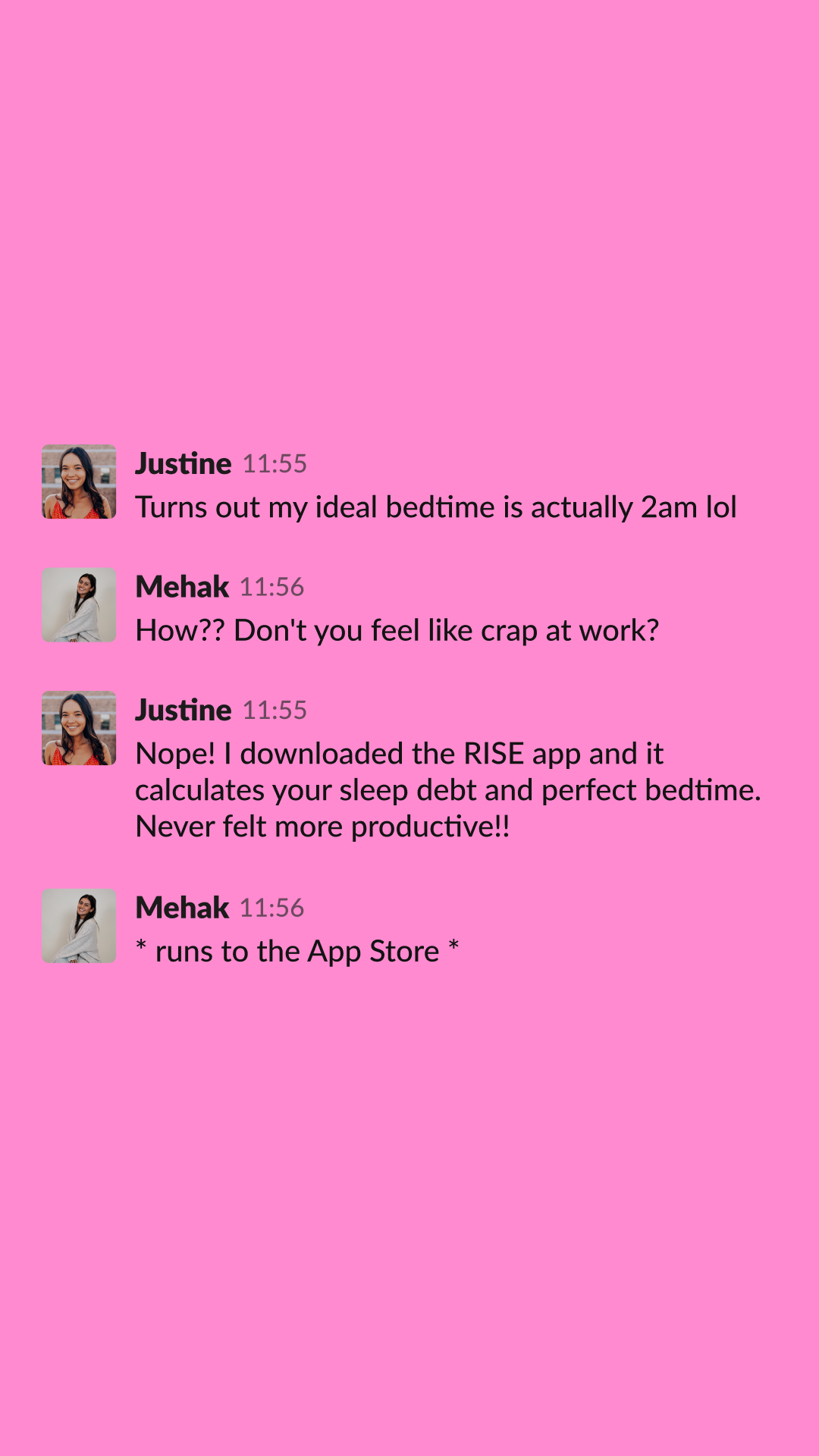
This is how much sleep you actually need... Take 1 min quiz to find out.
Voici une analyse détaillée de la création publicitaire pour Rise Science.
---
1. Le fond rose (couleur dominante).
2. Le texte "2am lol" (élément de choc).
3. Le nom de l'application "RISE app" au centre de la conversation.
1. [Accroche / Paradoxe]
"Turns out my ideal bedtime is actually 2am lol"
2. [Identification du problème / Objection]
"How?? Don't you feel like crap at work?"
3. [Présentation de la solution]
"Nope! I downloaded the RISE app and it calculates your sleep debt and perfect bedtime."
4. [Bénéfice ultime]
"Never felt more productive!!"
5. [Appel à l'action simulé]
" runs to the App Store "
"This is how much sleep you actually need... Take 1 min quiz to find out."
> "Square 1:1 ad visual at 2K resolution. Solid vibrant neon pink background. Minimalist layout featuring a simulated smartphone text conversation (WhatsApp/iMessage style) between two female profiles with realistic avatars. Typography: Clean, modern sans-serif. Text displayed: Justine: 'Turns out my ideal bedtime is actually 2am lol', Mehak: 'How?? Don't you feel like crap at work?', Justine: 'Nope! I downloaded the RISE app and it calculates your sleep debt and perfect bedtime. Never felt more productive!!', Mehak: ' runs to the App Store '. No logos, no extra graphics, just the chat thread centered on the pink canvas."

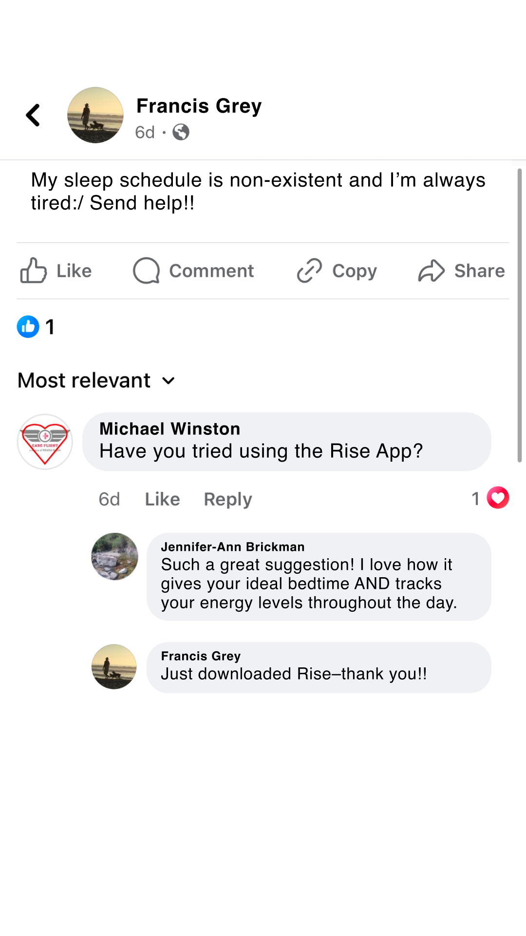
This is how much sleep you actually need... Take 1 min quiz to find out.
Voici une analyse détaillée de la publicité pour l'application Rise Science.
---
1. Le message de détresse (Problème).
2. La réponse de Michael (Solution suggérée).
3. Le commentaire détaillé de Jennifer-Ann (Preuve des bénéfices).
4. La conclusion de Francis (Action positive).
[Problématique / Hook]
"My sleep schedule is non-existent and I’m always tired:/ Send help!!"
[Introduction de la solution]
"Have you tried using the Rise App?"
[Bénéfices produits]
"Such a great suggestion! I love how it gives your ideal bedtime AND tracks your energy levels throughout the day."
[Clôture / Validation]
"Just downloaded Rise–thank you!!"
[Accroche Meta]
"Become an early riser ⛅️"
[Body text]
"This is how much sleep you actually need... Take 1 min quiz to find out."
> "Square 1:1 ad visual at 2K resolution. High-fidelity mockup of a Facebook comment thread. The background should be clean white/light grey, mimicking the mobile UI of Facebook. Use authentic-looking profile pictures for three different personas.
>
> Layout:
> 1. Top post from 'User A' expressing a relatable pain point about being tired.
> 2. First comment from 'User B' suggesting the app 'Rise'.
> 3. Second nested comment from 'User C' explaining two key benefits (bedtime & energy tracking).
> 4. Final reply from 'User A' saying they just downloaded it.
>
> Typography: Standard system Sans-Serif (SF Pro or Arial).
> Palette: Facebook UI colors (Blue #1877F2 for icons/names, light grey for comment bubbles).
> Style: Clean digital screenshot/UGC mockup style. No brand logos inside the image."

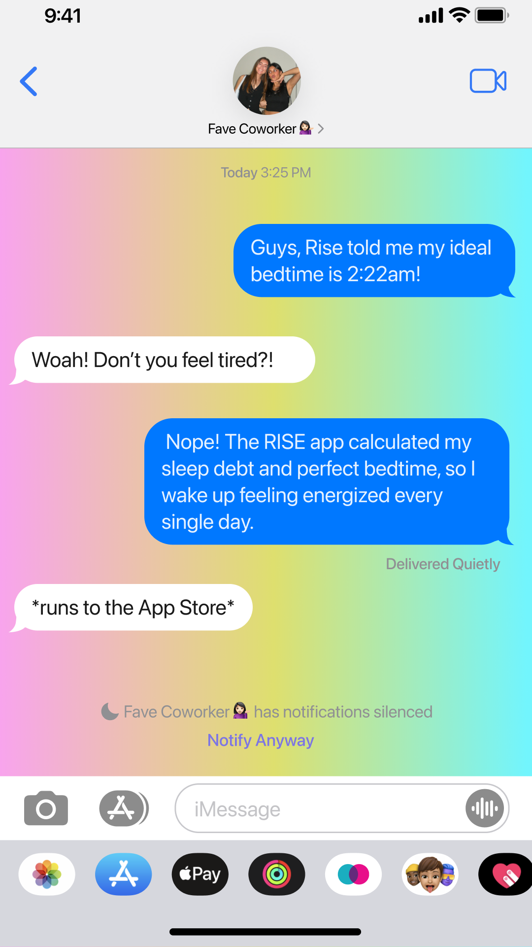
STOP right now. Here's the new life hack that just changed everything
Voici une analyse détaillée de la création publicitaire pour Rise Science.
---
1. Le fond multicolore (Attraction).
2. Les bulles de texte bleues et blanches (Lecture du récit).
3. Le message "2:22am" (L'élément de choc/curiosité).
4. Le bas de l'écran avec les icônes d'apps (Crédibilité du mockup).
> Square 1:1 ad visual at 2K resolution.
> Layout: High-fidelity iPhone iMessage UI mockup. Top status bar (time 9:41, signal icons), chat header with contact "Fave Coworker 👩🏾", and bottom iOS app dock/keyboard area.
> Background: Vibrant, high-saturation neon gradient (Pink to Yellow to Green to Blue).
> Typography: Apple System Font (San Francisco).
> Text bubbles:
> - Blue (User): "Guys, Rise told me my ideal bedtime is 2:22am!"
> - Grey (Friend): "Woah! Don't you feel tired?!"
> - Blue (User): "Nope! The RISE app calculated my sleep debt and perfect bedtime, so I wake up feeling energized every single day."
> - Grey (Friend): "runs to the App Store"
> Additional Elements: "Delivered Quietly" and "Notify Anyway" system text included for realism.

This is how much sleep you actually need... Take the 3 min quiz to find out.
Voici une analyse détaillée de la création publicitaire pour Rise Science.
---
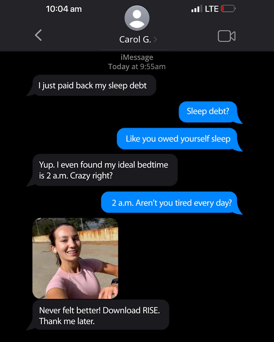
1. L'interface iMessage (le contexte).
2. La photo de la femme souriante (l'élément humain/preuve).
3. Le mot "Sleep debt" (le concept intriguant).
Note : Non visible directement sur l'image fournie mais mentionné dans le brief.
"Square 1:1 ad visual at 2K resolution. Layout: A realistic iPhone iMessage conversation in Dark Mode. Typography: iOS system font (SF Pro). Palette: Deep black background, standard iMessage blue and grey bubbles. Text displayed: A dialogue starting with 'I just paid back my sleep debt', followed by a skeptical reply, then a counter-intuitive reveal about a 2 a.m. bedtime. Visual element: Include a high-quality UGC-style selfie of a healthy, energetic person (woman in her 20s-30s) wearing athletic gear in an outdoor setting, appearing as an image sent within the chat. CTA: The final message should say 'Never felt better! Download RISE. Thank me later.'."

This is how much sleep you actually need... Take the 3 min quiz to find out.
Voici une analyse détaillée de la création publicitaire pour Rise Science.
---
1. Le texte "2am" (Contraste et curiosité).
2. Les bulles de réponse bleues (On cherche à voir la réaction).
3. Le nom de l'expéditeur "Carol G." (Humanise l'échange).
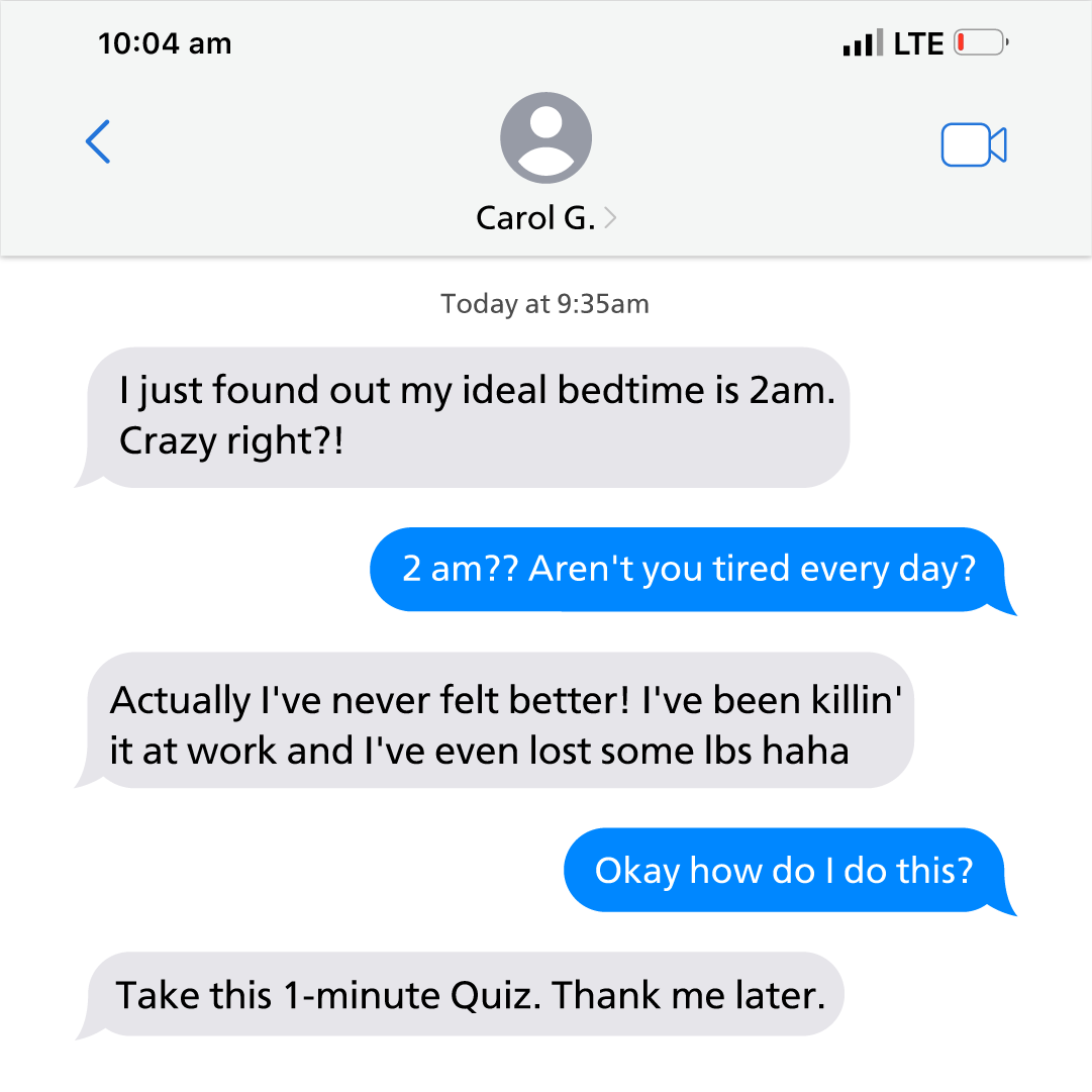
Chunk 1 :
"I just found out my ideal bedtime is 2am. Crazy right?!"
Chunk 2 :
"2 am?? Aren't you tired every day?"
Chunk 3 :
"Actually I've never felt better! I've been killin' it at work and I've even lost some lbs haha"
Chunk 4 :
"Okay how do I do this?"
Chunk 5 :
"Take this 1-minute Quiz. Thank me later."
"Square 1:1 ad visual at 2K resolution. A high-fidelity mockup of an iPhone iMessage conversation. The background is the standard iOS white/light gray. At the top, include status bar icons (Time: 10:04 am, LTE, low battery). Contact name is 'Carol G.' with a generic profile icon. The chat features 5 bubbles (3 gray on the left, 2 blue on the right). Text displayed: 'I just found out my ideal bedtime is 2am. Crazy right?!' (Gray), '2 am?? Aren't you tired every day?' (Blue), 'Actually I've never felt better! I've been killin' it at work and I've even lost some lbs haha' (Gray), 'Okay how do I do this?' (Blue), 'Take this 1-minute Quiz. Thank me later.' (Gray). Style: Clean, native-looking screenshot, no logos or extra graphics."

This is how much sleep you actually need... Take the 3 min quiz to find out.
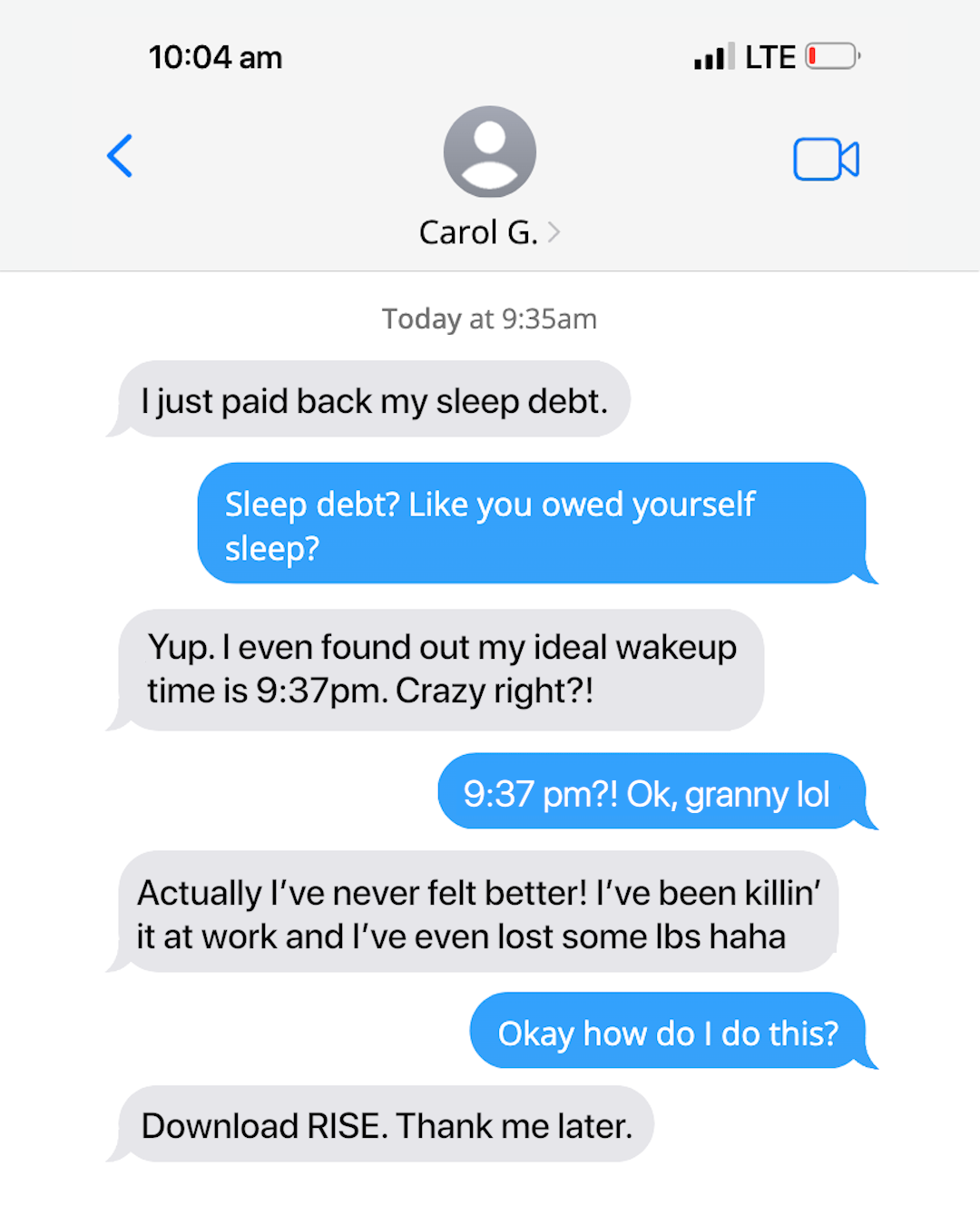
Voici une analyse détaillée de la publicité pour Rise Science.
---
1. Le format "bulles de texte" (contexte).
2. Le chiffre intrigant "9:37 pm" (élément de choc/curiosité).
3. Le nom de l'application "RISE" en conclusion.
> "Square 1:1 ad visual at 2K resolution. The visual must look like a high-quality iMessage conversation screenshot on an iPhone. Top status bar shows 10:04 am, LTE, and a slightly low battery icon. Contact name is 'Carol G.' with a default grey user avatar. Text conversation flow: Grey bubble: 'I just paid back my sleep debt.' -> Blue bubble: 'Sleep debt? Like you owed yourself sleep?' -> Grey bubble: 'Yup. I even found out my ideal wakeup time is 9:37pm. Crazy right?!' -> Blue bubble: '9:37 pm?! Ok, granny lol' -> Grey bubble: 'Actually I’ve never felt better! I’ve been killin’ it at work and I’ve even lost some lbs haha' -> Blue bubble: 'Okay how do I do this?' -> Grey bubble: 'Download RISE. Thank me later.'. Typography: San Francisco (Apple system font). Colors: Official iMessage blue (#007AFF) and light grey. Style: Clean UI mockup, no background distractions."

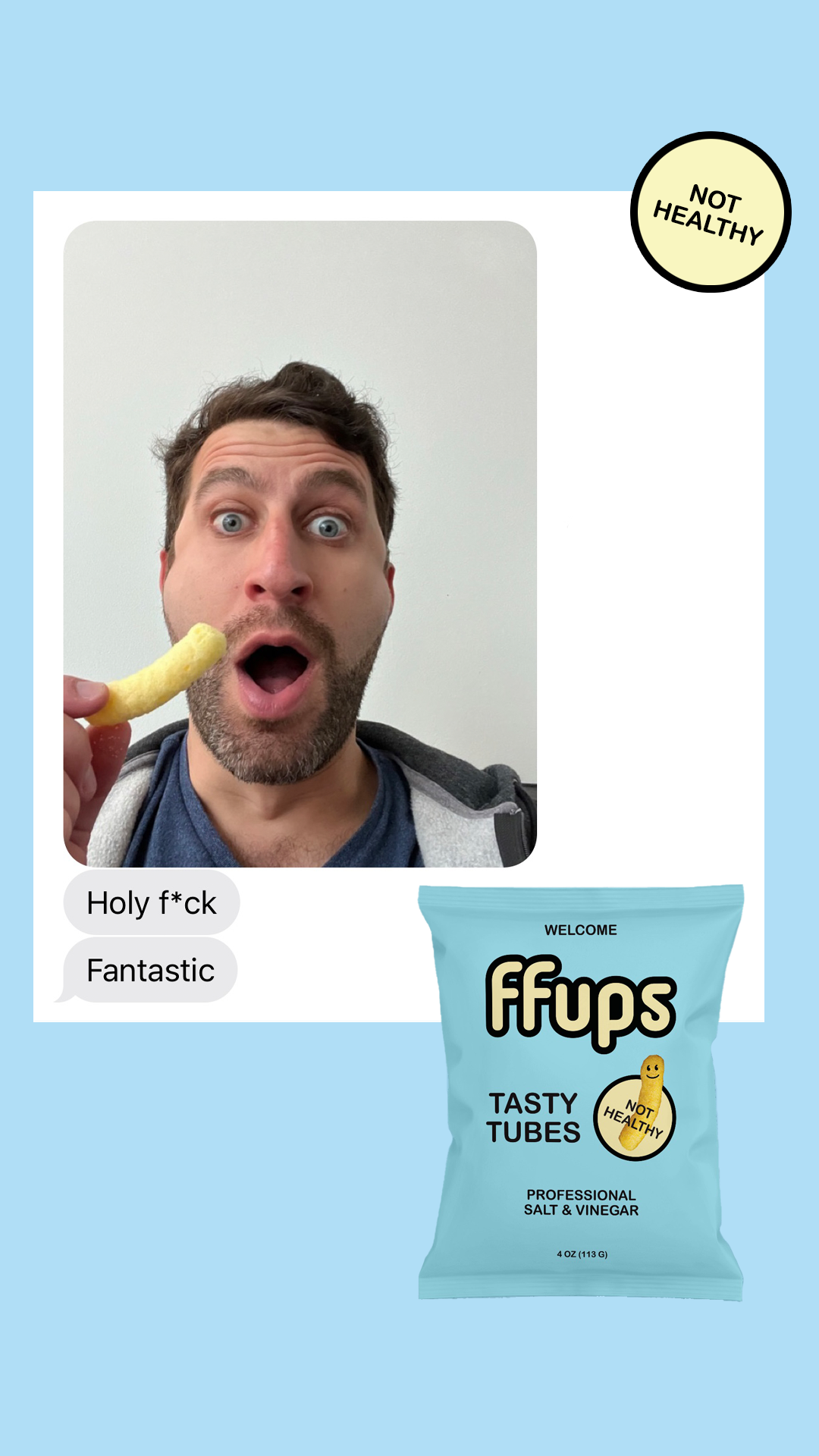
Healthy snacks are boring. FFUPs are not healthy, just delicious puffs that come in 5 classic flavors. Who knew a puff could taste this good?
Voici une analyse détaillée de la publicité pour la marque FFUPs.
---
1. Le visage expressif (UGC style).
2. Le badge "NOT HEALTHY" (Contradiction marketing).
3. Le sachet de produit (Identification de la marque).
4. Les bulles de texte style iMessage (Preuve sociale informelle).
"Square 1:1 ad visual at 2K resolution. Split layout design on a solid light blue (#AEE1F9) background. On the left: A centered vertical polaroid-style photo of a man with a beard making a shocked, wide-eyed facial expression, holding a yellow corn puff near his open mouth. Below the photo, two grey and white iMessage-style text bubbles saying 'Holy f*ck' and 'Fantastic'. On the right: A professional 3D mockup of a light blue snack bag labeled 'ffups' in bold black rounded lowercase letters. Top right corner: A prominent yellow circular badge with a thick black border containing the text 'NOT HEALTHY' in bold black sans-serif. Minimalist, clean, and humorous aesthetic."

"Beautiful necklace. Love how the birthday stone shine and the flower is designed."
---
Voici une analyse détaillée de la publicité vidéo pour la marque de bijoux MYKA.
---
---
[Preuve sociale émotionnelle & Hook]
"This is the best gift EVERRR!!!"
[Découverte produit & Expérience premium]
Action visuelle d'ouverture de l'écrin MYKA
[Personnalisation & Sentiment]
"Rosemarie" / "Charlotte" (gravés sur les pendentifs)
[Démonstration de style & Lifestyle]
Zoom sur le collier porté avec une chaîne à maillons
---
---
---
C'est une publicité Meta typique et performante : elle règle un problème (trouver un cadeau), montre le produit en action, et utilise des codes sociaux (WhatsApp) pour briser la résistance publicitaire.